

THALPORA / NOCTUA ALBA
A dual-brand end-to-end design of two distinct visual identities and comprehensive brand guidelines.
Shapes essential brand values into adaptable logos, curated typography, and structured design rules built for scalable application.
MY ROLE / Lead Brand Designer
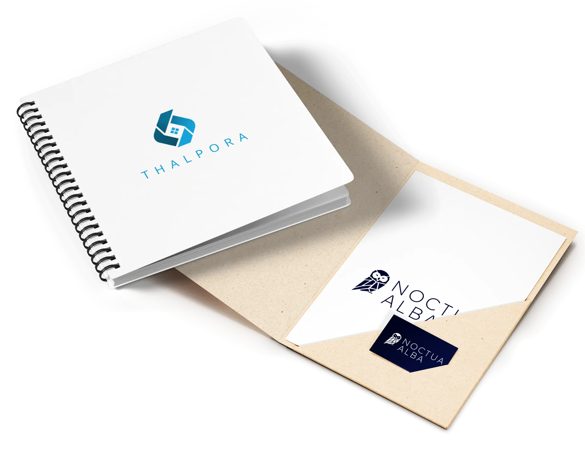
RESPONSABILITIES
- Identity & Logo Design /
Built primary/secondary logo suites, custom iconography, and scalable brand assets. - Color & Type Architecture /
Curated accessible color systems (RGB, CMYK, Hex) and typographic hierarchies optimized for digital and print execution. - Brand Style Guides /
Authored complete visual identity manuals covering clear space, grid alignment, usage constraints, and cross-channel application.
NOCTUA ALBA
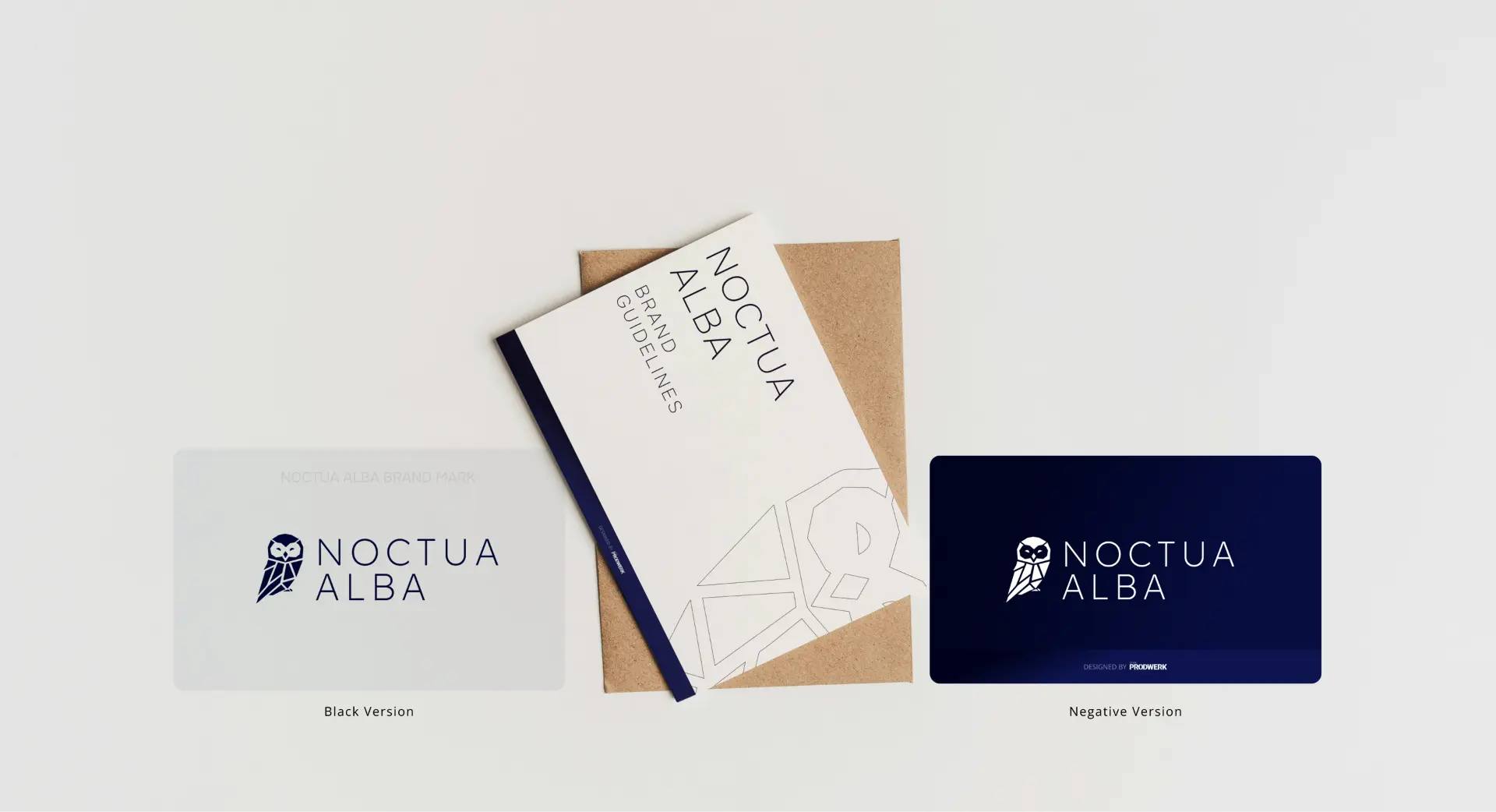
Crafted to meet specific client guidelines, creating a new identity that naturally integrates with the existing parent brand.
Black Version
Negative Version
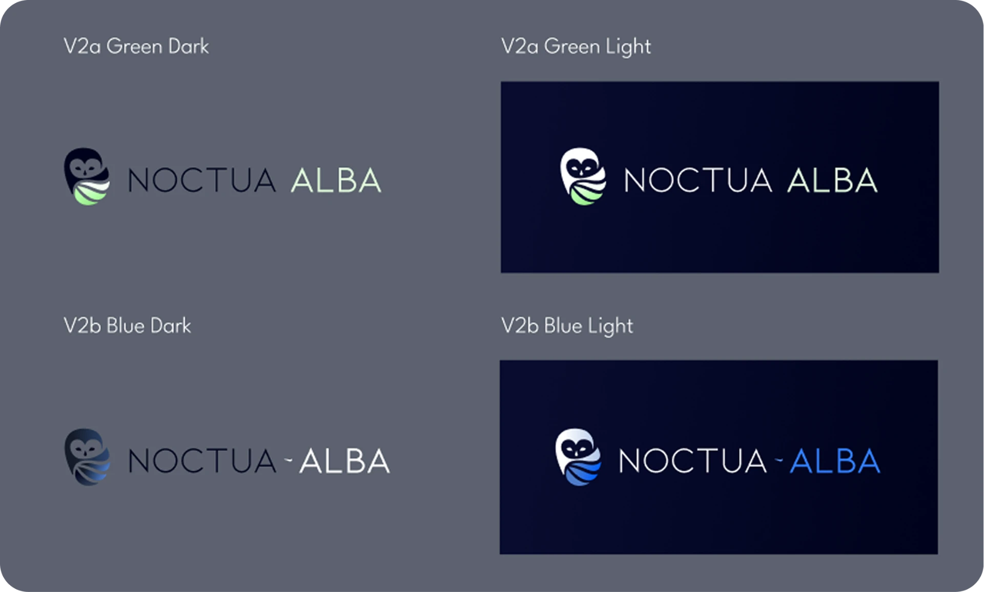
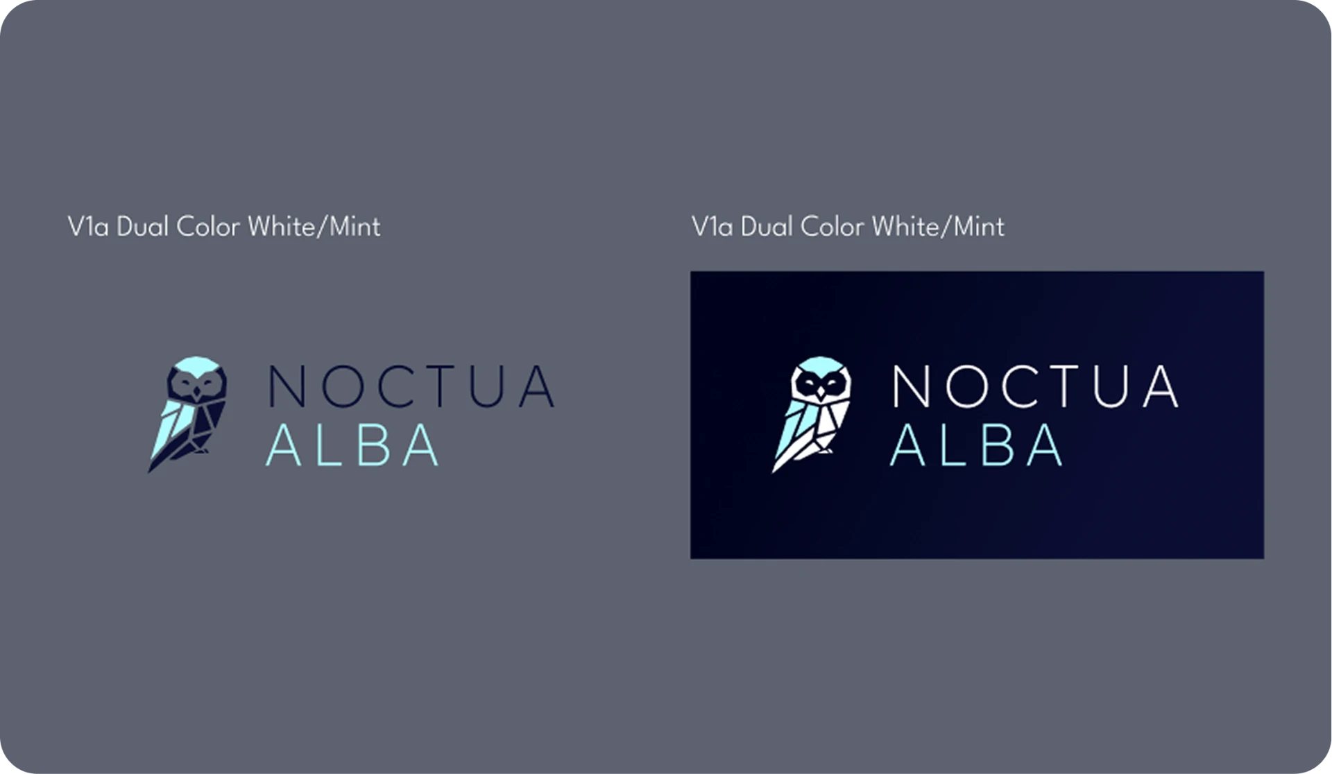
Key concepts explored on the path to the final logo. Built around a mandatory mosaic structure, iterations experimented with sharp versus rounded geometry and distinct color combinations to define a standout visual identity.
Presenting these structured variations gave the client full visual clarity, streaming the decision-making process and guiding the exact path toward the final logo.
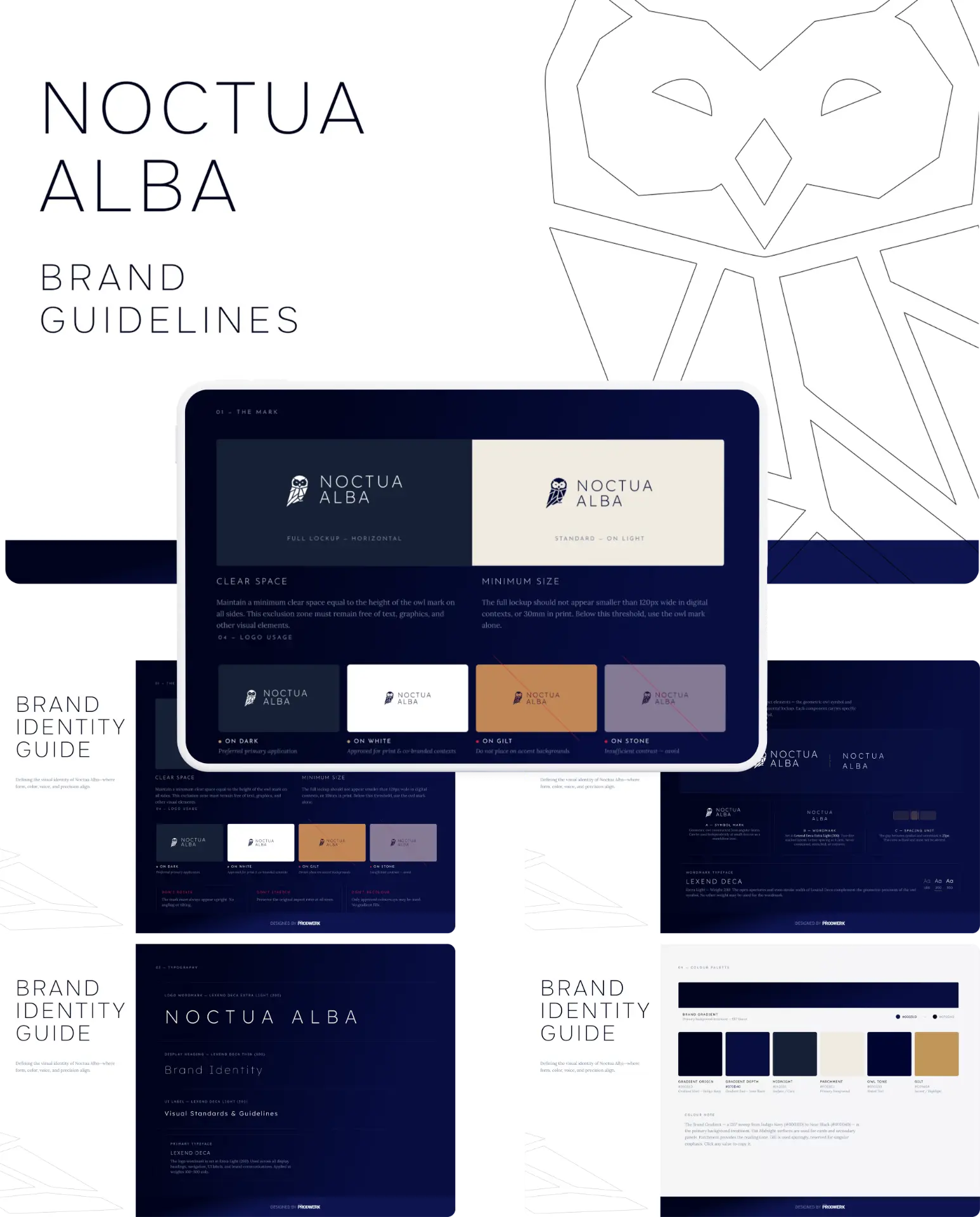
Developed the comprehensive Noctua Alba Brand Identity Guide. The guide sets strict rules for the geometric owl mark, precise clear space, and minimum sizing alongside a curated typography system.
It establishes a rich color palette, paired with explicit background guidelines and misuse constraints to ensure brand integrity across every touchpoint.

THALPORA
A platform connecting homebuyers directly with real estate developers.

Explored abstract geometric variations symbolizing modern apartment structures.
The color strategy relies on a cool, minimalist palette to project elegance, structural precision, and high investment confidence.
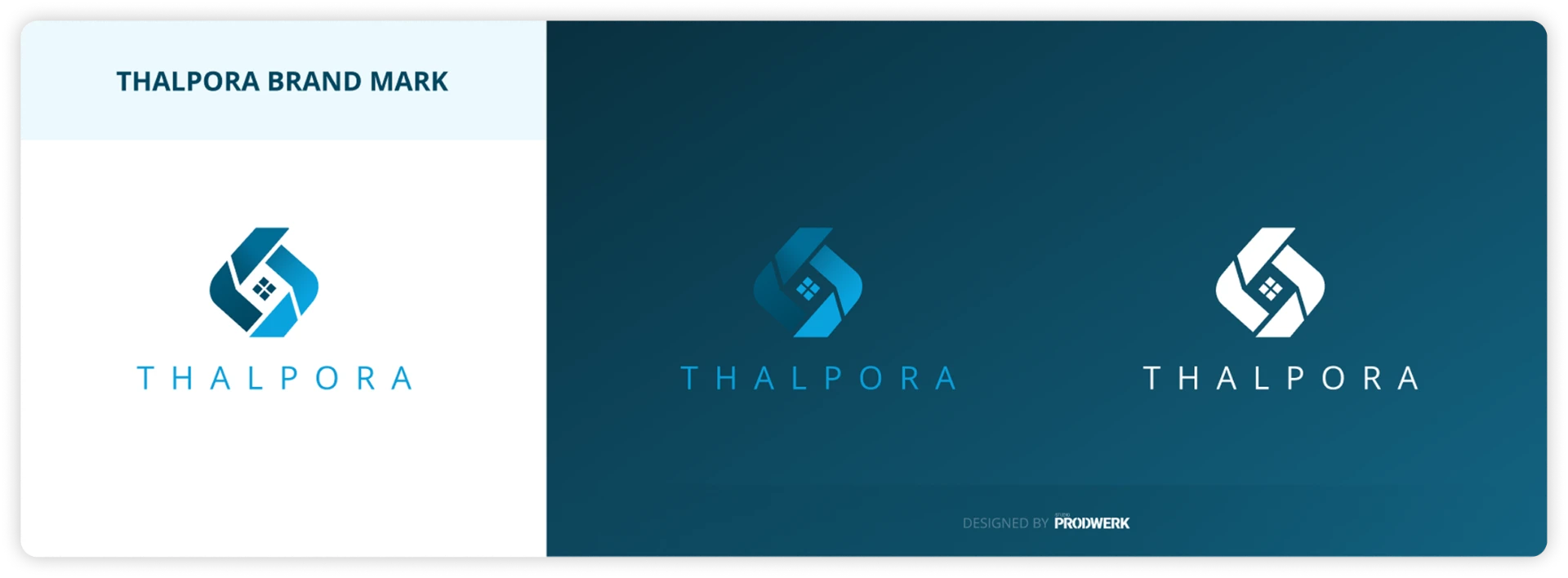
The final mark features a fresh blue tone to convey cleanliness, modernity, and trust. Paired with clean, minimalist typography, the identity reflects the platform's core promise: a simple, seamless process to secure your ideal property.

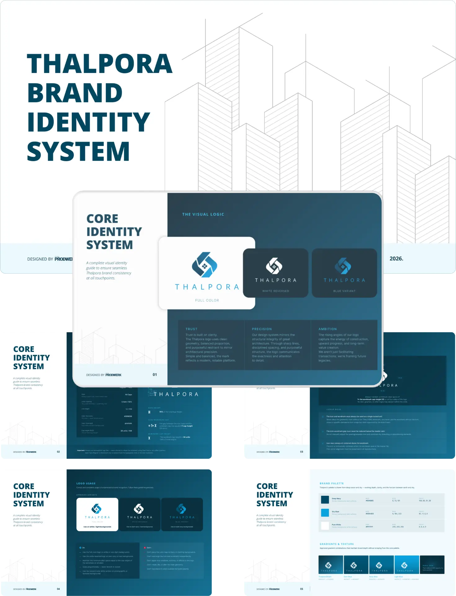
The Thalpora brand guidelines deliver an all-encompassing visual identity system—specifying precise logo construction and clearance rules, color application standards, clear spacing guidelines, and a cohesive typography architecture tailored to maintain brand integrity across all touchpoints.