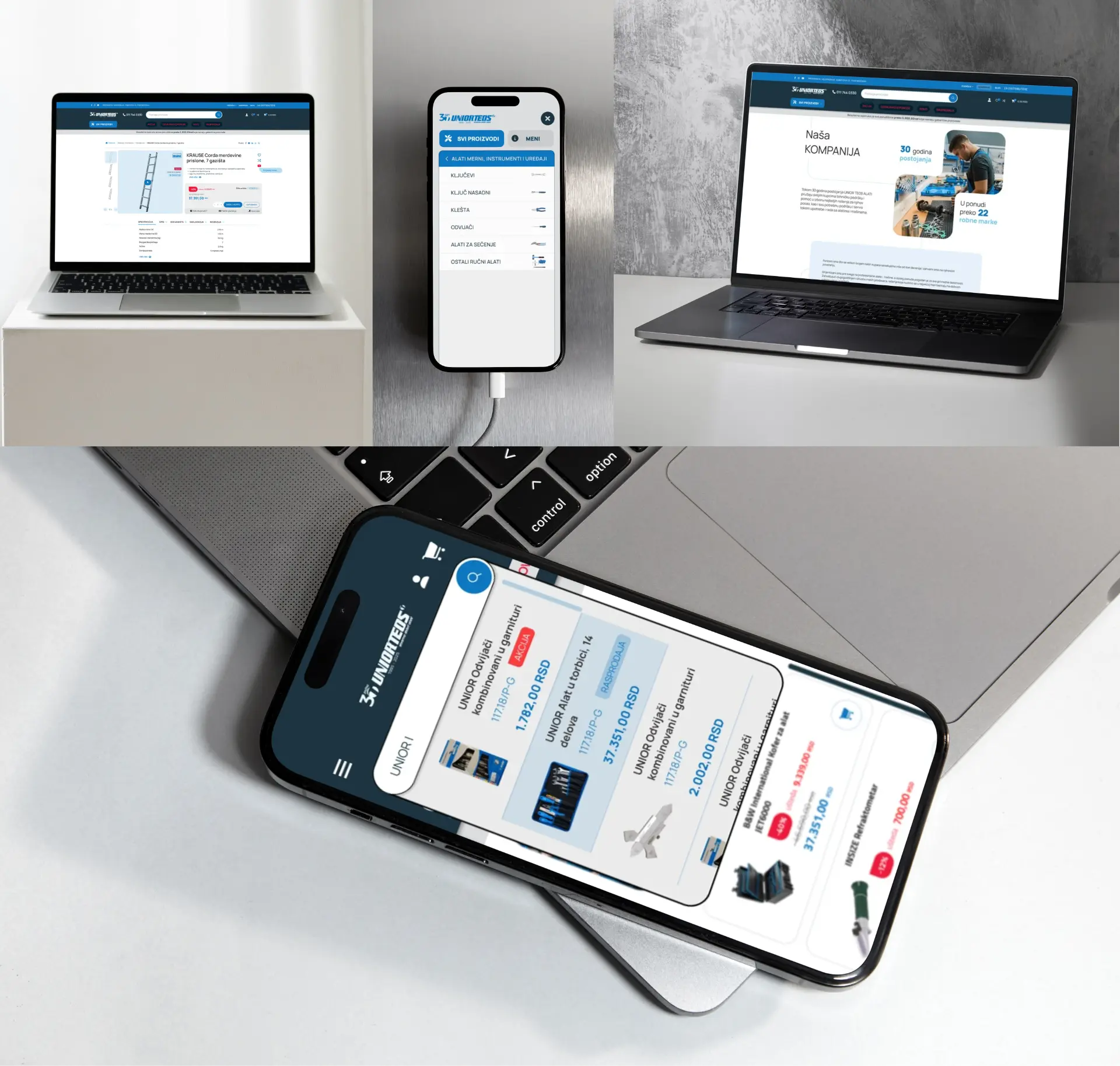

UNIOR TEOS
A leading distributor
and e-commerce store
for professional tools.
Allows buyers to easily explore and order tools, while giving the merchant full control to showcase and update their entire product catalog with detailed specifications.
MY ROLE / Lead UX/UI Designer
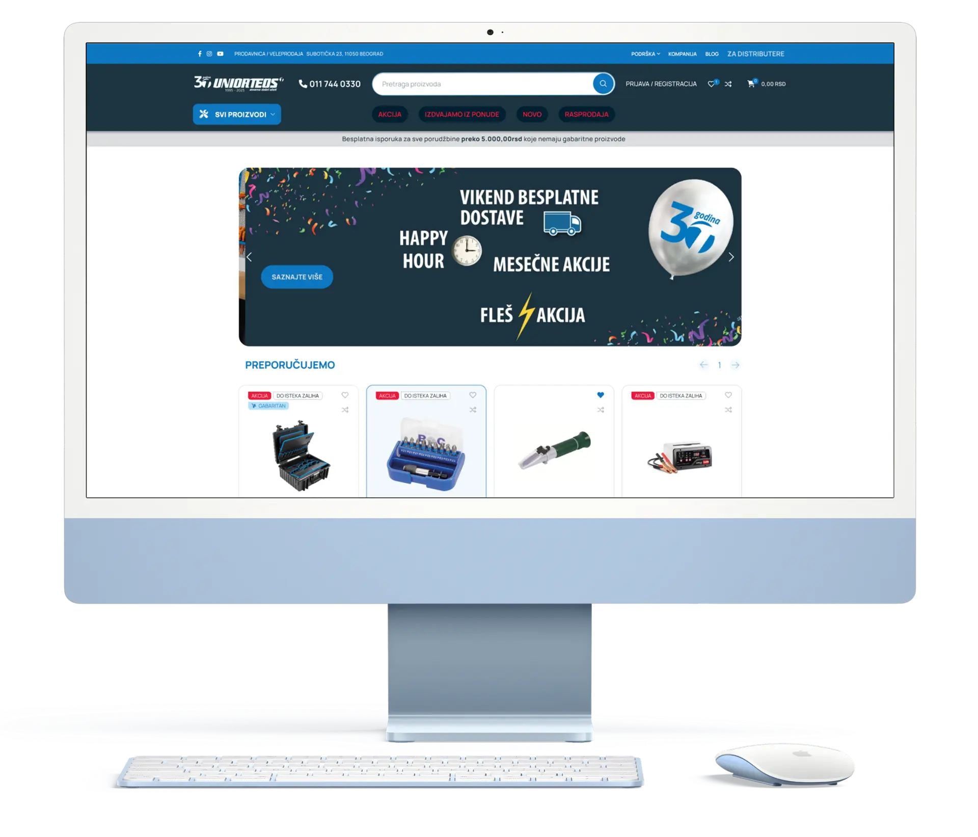
The Challenge
The Root Cause
- Non-Technical User Base / Around 90% of active users are tradespeople and craftsmen (non-IT professionals) who require an extremely intuitive, straightforward shopping experience without technical complexity.
- Losing Market Share to Competitors / Customers consistently preferred rival platforms due to better user experience, directly driving down Unior Teos's online sales performance.
The Solution
- Brand-Consistent Modernization / Refreshed the visual presentation while strictly adhering to the client's existing style guide, preserving brand recognition.
- Simplified Navigation & Search / Redesigned product categories and search filters to allow non-technical users to quickly locate specific tools with minimal clicks.
- High-Contrast, Readable Layouts / Structured product cards and technical specifications with clear typography and strong visual hierarchy for effortless scannability.
Phase 1.Research & Competitor Analysis with Website Redesign
Mastered complex Amazon seller mechanics while gathering direct feedback from active users to stay ahead of the competition.
Competitor Benchmarking
Evaluated direct competitors to identify market standards, UX gaps, and opportunities to stand out.
User Feedback Analysis
Analyzed user feedback sessions on the legacy site to map out friction points, drop-off triggers, and navigation bottlenecks.
Brand-Consistent Modernization
Refreshed the visual presentation while strictly adhering to the client's existing style guide to preserve brand recognition.
Problem:
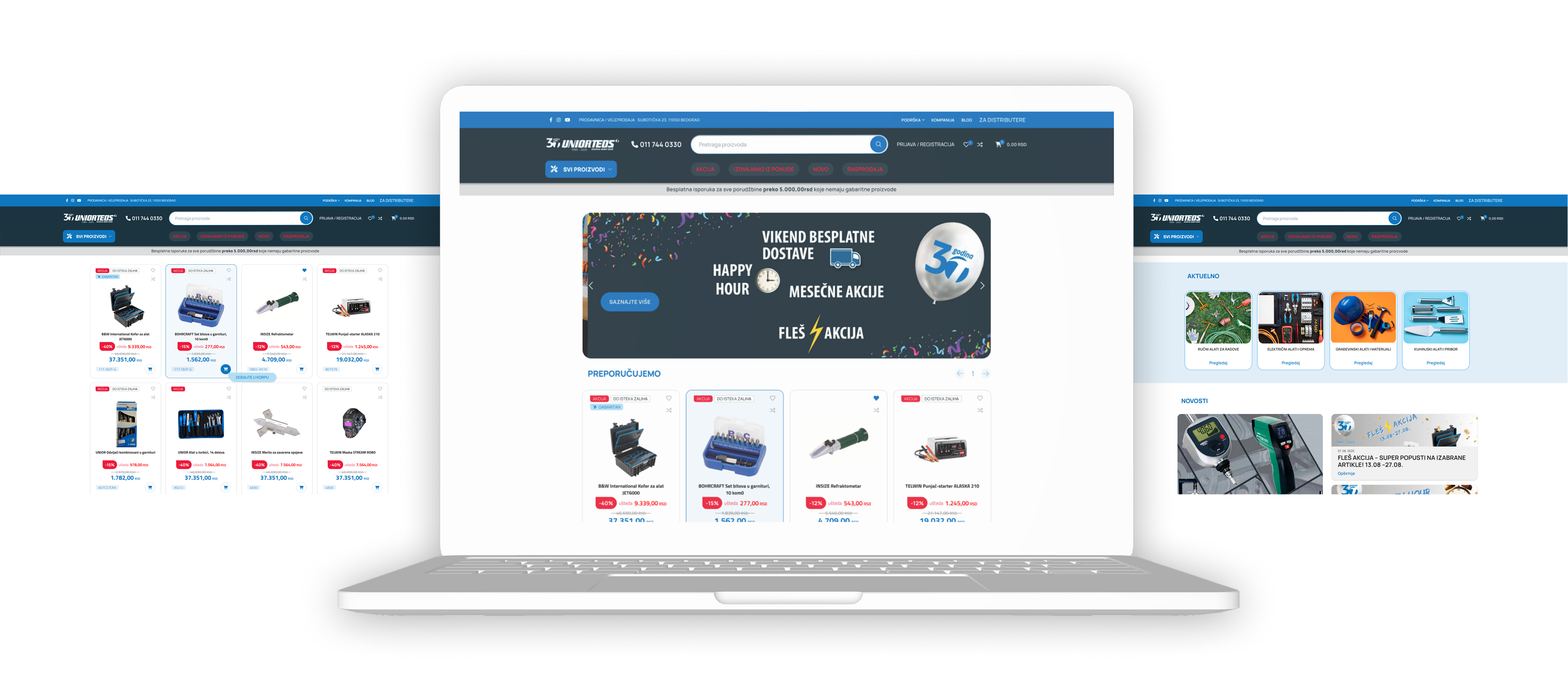
- Confusing Header & Quick-Access Links:Quick-access links were split across two locations with imprecise labels, leaving users uncertain of their destination. Essential information—such as direct contact numbers—was poorly visible, increasing user friction.
- Overwhelming Top Section:An oversized header and slider dominated the screen, pushing featured products below the fold and distracting users.
Solution:
- Unified, Clear Navigation:Consolidated all product categories into a single, logically organized header structure with intuitive labels.
- Streamlined Hero & Slider:Reduced top section height to give immediate visual priority to featured products and quick-purchase items.
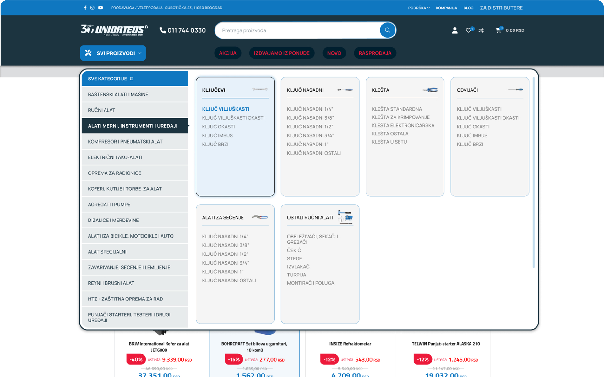
Problem:
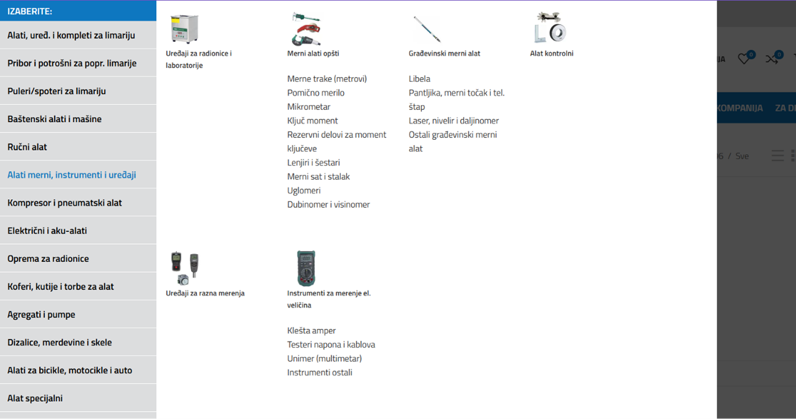
- Legacy Friction:The outdated product category layout lacked functional structure and visual hierarchy, making browsing slow and unintuitive.
Solution:
- Restructured category representation:Organized categories into distinct visual clusters with image-led subcategories, maintaining strict consistency in product nomenclature.Added an all-inclusive catalog screen to give users a high-level overview of the complete product range.
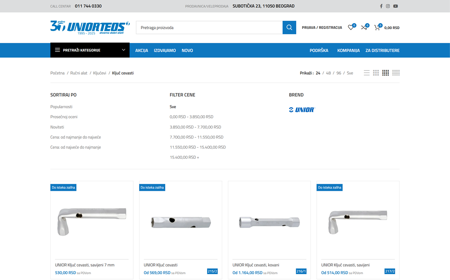
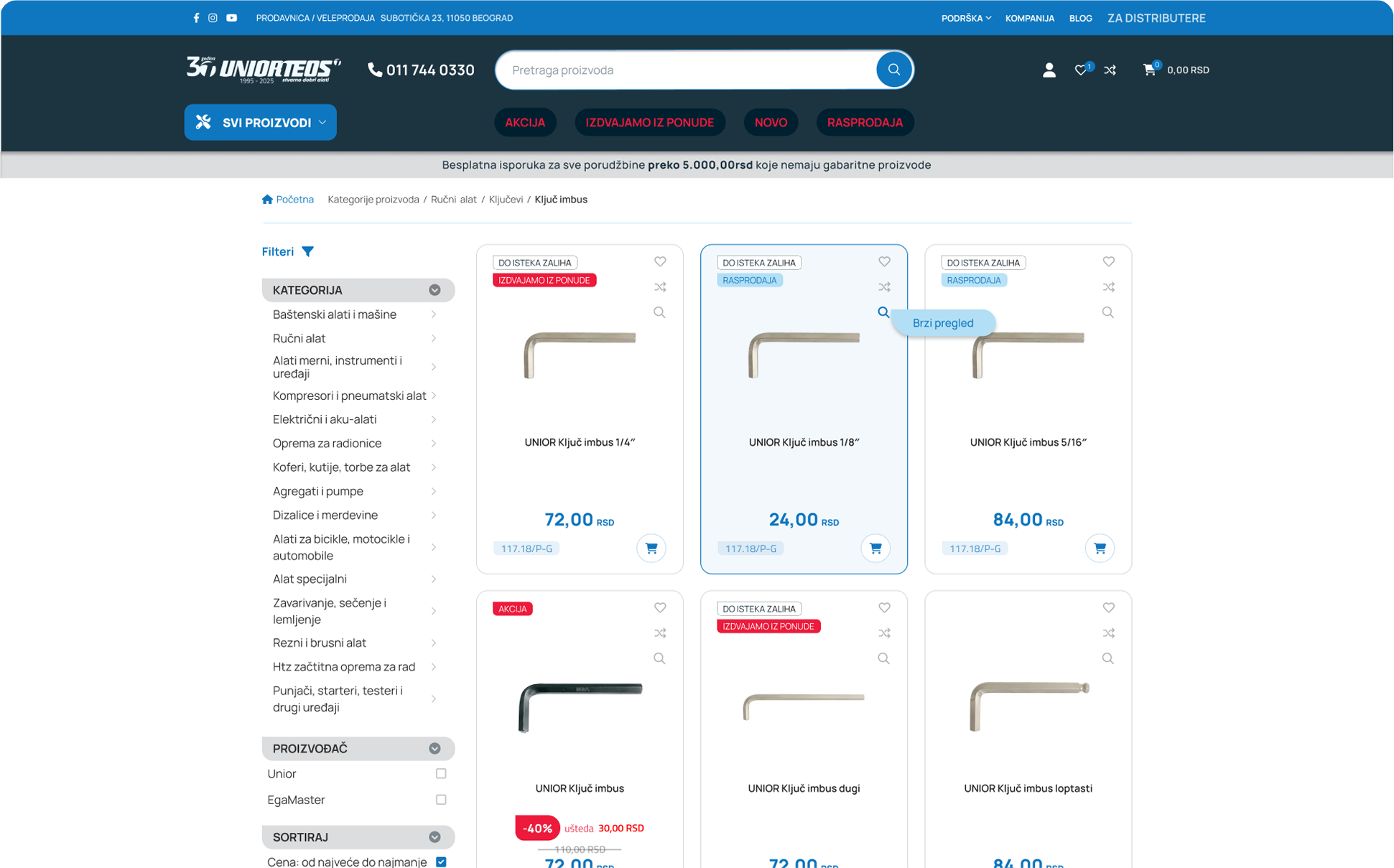
Problem:
- Cluttered Layout:Persistent, uncollapsible filters consumed excessive screen space and disrupted product browsing.
- Hidden Actions & Low Contrast:Uniform product labels blurred visual hierarchy, while hidden 'Add to Cart' hover triggers confused users.
Solution:
- Collapsible Left-Sidebar Filters:Fixed side navigation with accordion toggles keeps filtering accessible without crowding the product grid.
- High-Impact Visual Badges:Color-coded labels instantly highlight discounts, promotions, and key product attributes.
- Persistent Cart Action & Comparisons:Always-visible 'Add to Cart' buttons speed up buying, while a new comparison tool directly supports fast decision-making.
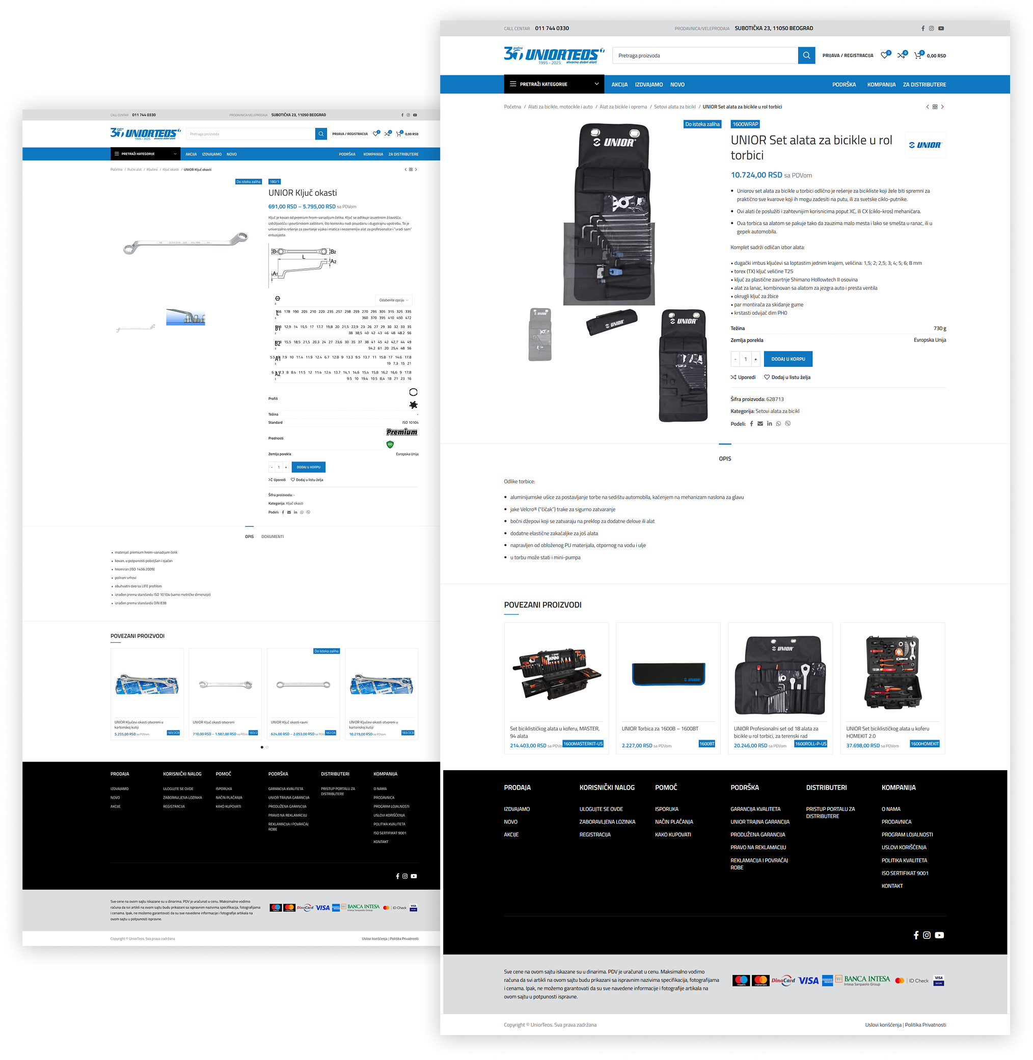
Clutter-Free Interface: Relocated complex filter sets to a dedicated, full-screen overlay to maximize vertical screen space and eliminate visual clutter.
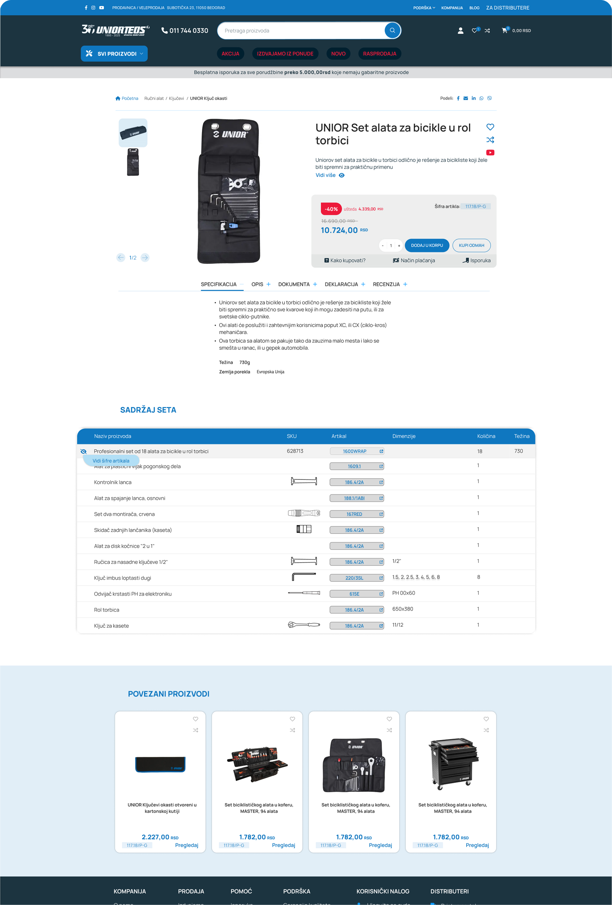
Transformed tool set displays (previously placed under the description section) into an interactive table.
Value: Users can instantly check item quantities within the set and click any specific tool to inspect its individual details.
Phase 2.Mobile Adaptation
Displaying dense product catalogs, extensive attribute filters, and complex technical specification tables on small screens without overwhelming non-technical users.
Progressive Disclosure via Dropdowns
Collapsed dense data sets, long specification lists, and category filters into intuitive dropdown components and expandable accordion drawers.
Touch-Friendly Interface
Scaled key action buttons and touch targets to accommodate field use on mobile devices.
Clean Data Hierarchy
Prioritized critical product details (price, availability, core specs) above the fold, keeping secondary technical data cleanly hidden until expanded.
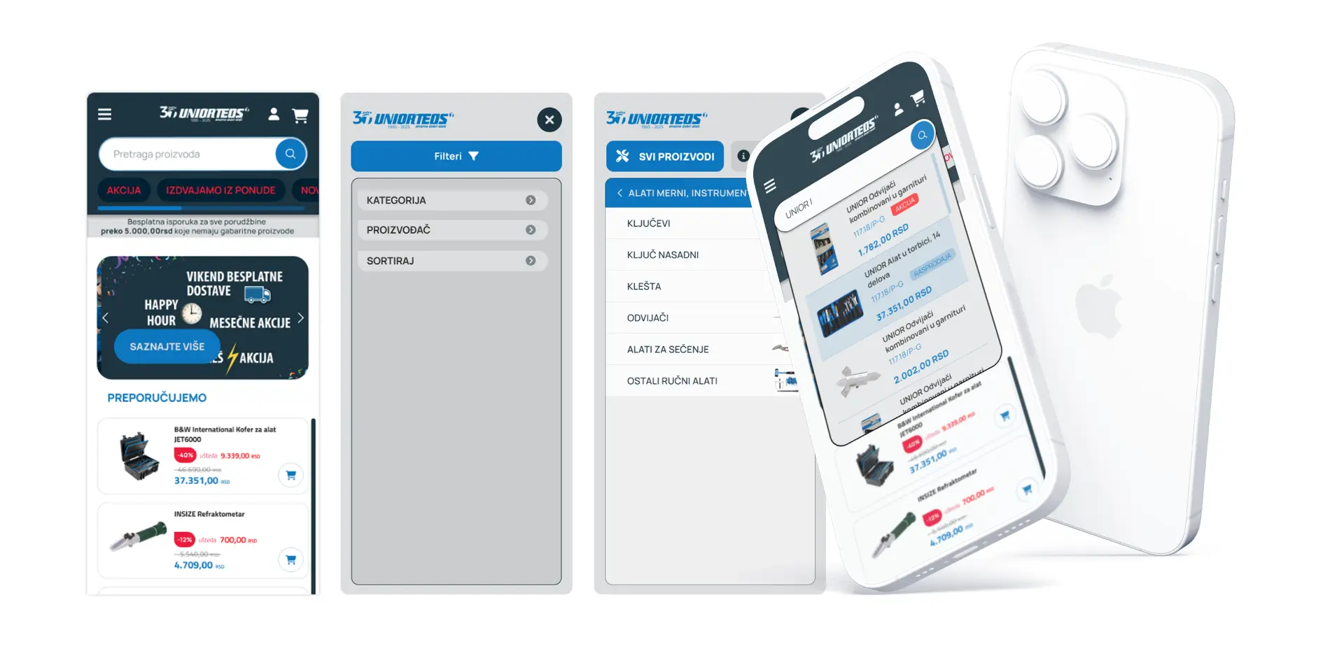
Clutter-Free Interface: Relocated complex filter sets to a dedicated, full-screen overlay to maximize vertical screen space and eliminate visual clutter.
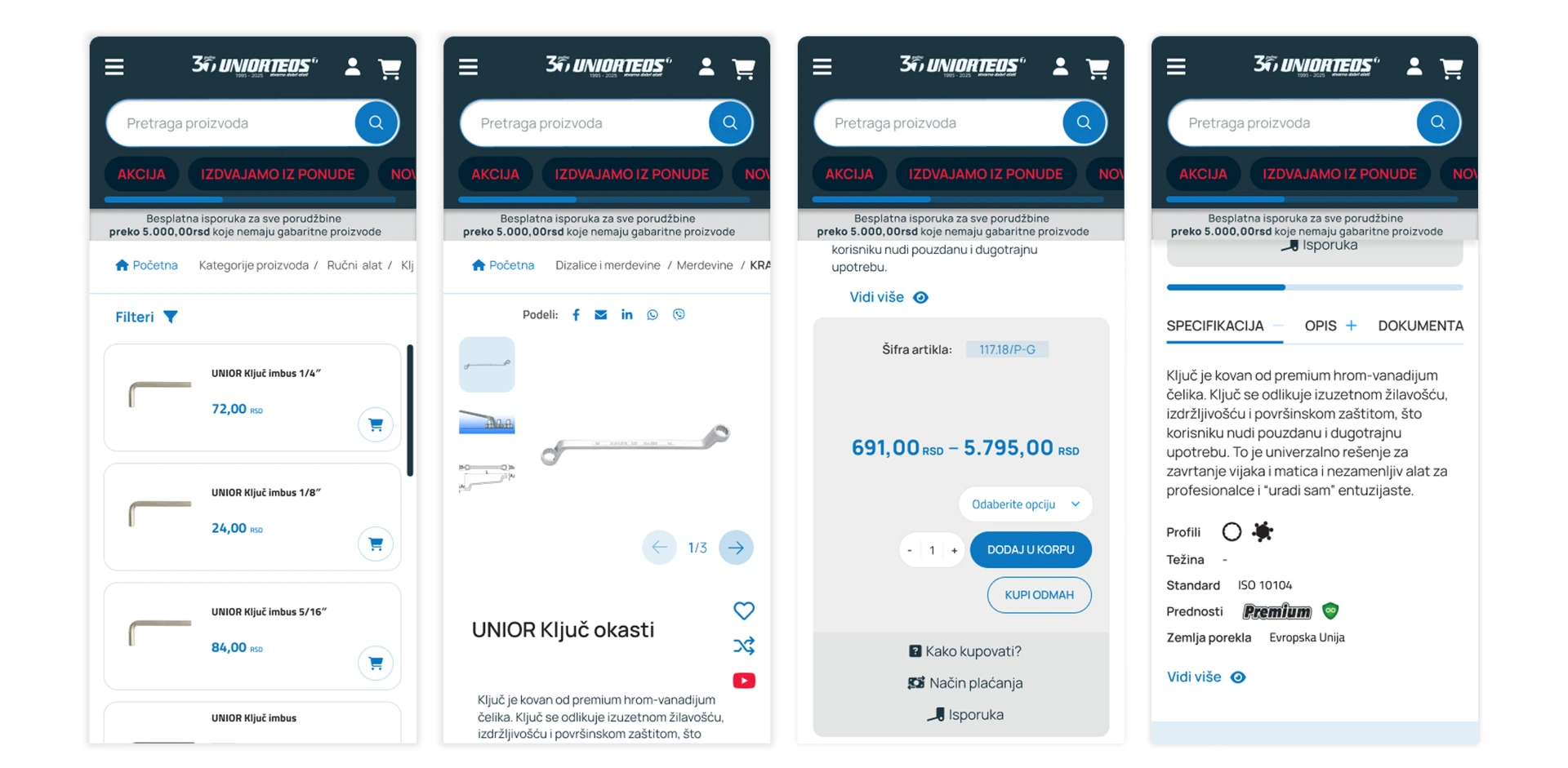
Kept the focus on key purchasing triggers—high-res product image, item name, pricing, and prominent Quick Add to Cart button, allowing users to build their order without interrupting their shopping flow. Other information is included in single view.
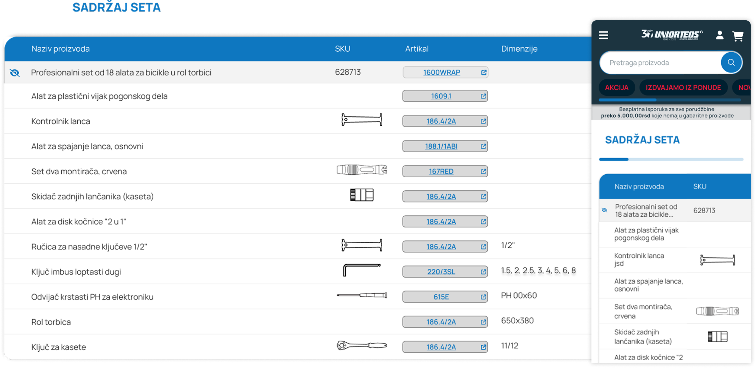
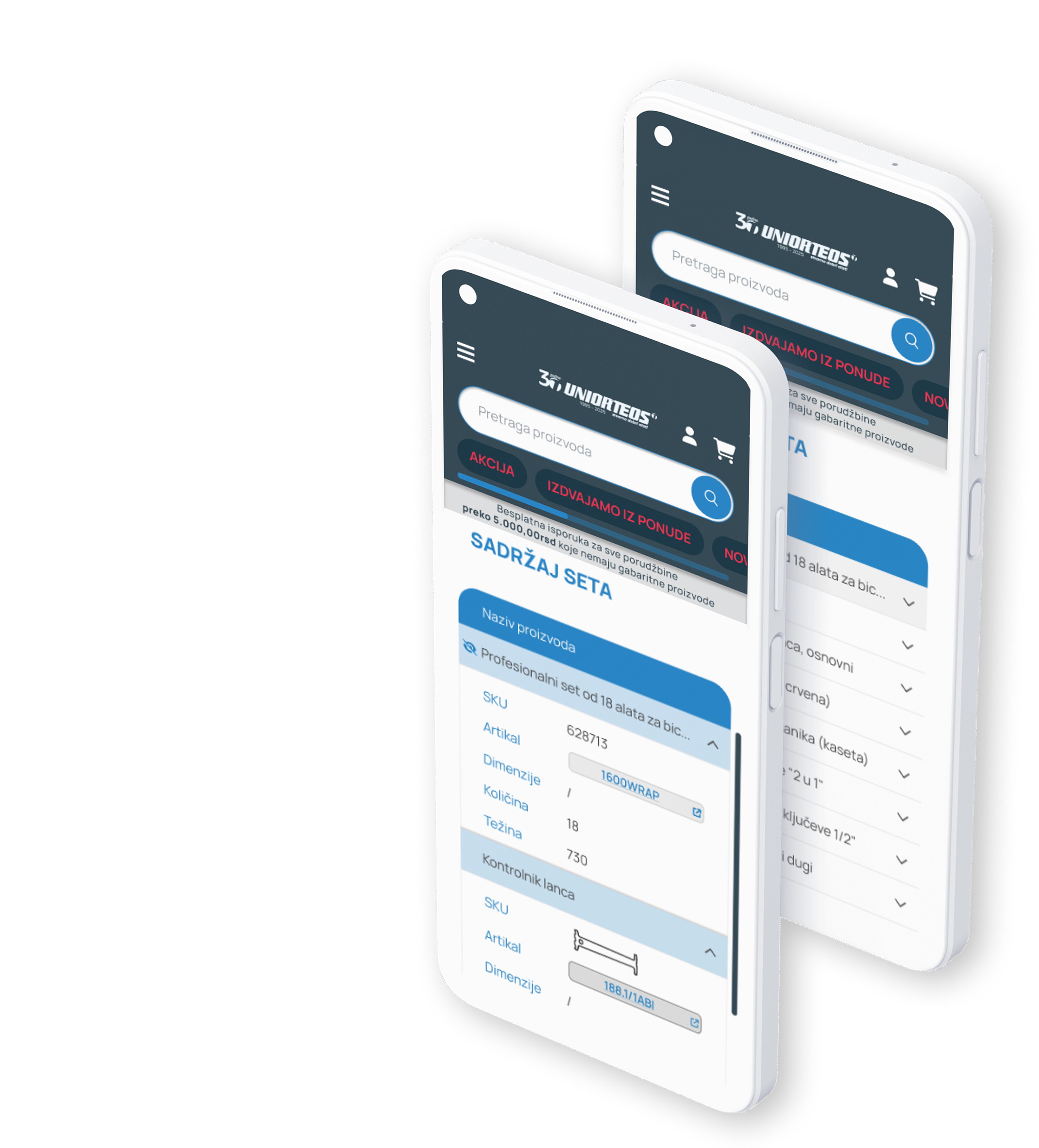
Challange: Adapting Set details for Mobile Desktop easily accommodated complex set breakdown tables, but replicating this on smaller mobile screens caused layout constraints.
Tested Approach: Horizontal swipeable tables were initially introduced, but user testing confirmed poor interaction rates and visual clutter.
Final UX Solution: Switched to progressive disclosure using interactive dropdowns. Each set component now expands on demand, maintaining a clear layout and fast scannability on mobile.