
Seller Tools
All-in-one SaaS suites for Amazon third-party sellers
Ecosystem built to help sellers automate keyword tracking, analyze competitor strategy, and cut operational tool costs.
MY ROLE / UX/UI Designer
The Challenge
The Root Cause
- Data Overwhelm / Amazon sellers struggle with complex data across too many tools, slowing down critical business decisions.
- Cluttered Navigation / Hard-to-navigate platforms make key metrics difficult to find, causing friction for power users.
- Loss of Competitive Edge / Outdated research workflows lead to missed keyword opportunities, lower rankings, and lost sales.
The Solution
- Navigation Overhaul & Visual Refresh / Restructured the sidebar and made advanced research tools easier to find.
- In-Browser Chrome Extension / Added real-time analysis directly to live Amazon pages.
- User-Validated Design / Refined workflows through direct feedback from active sellers.
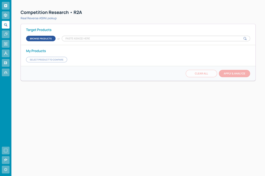
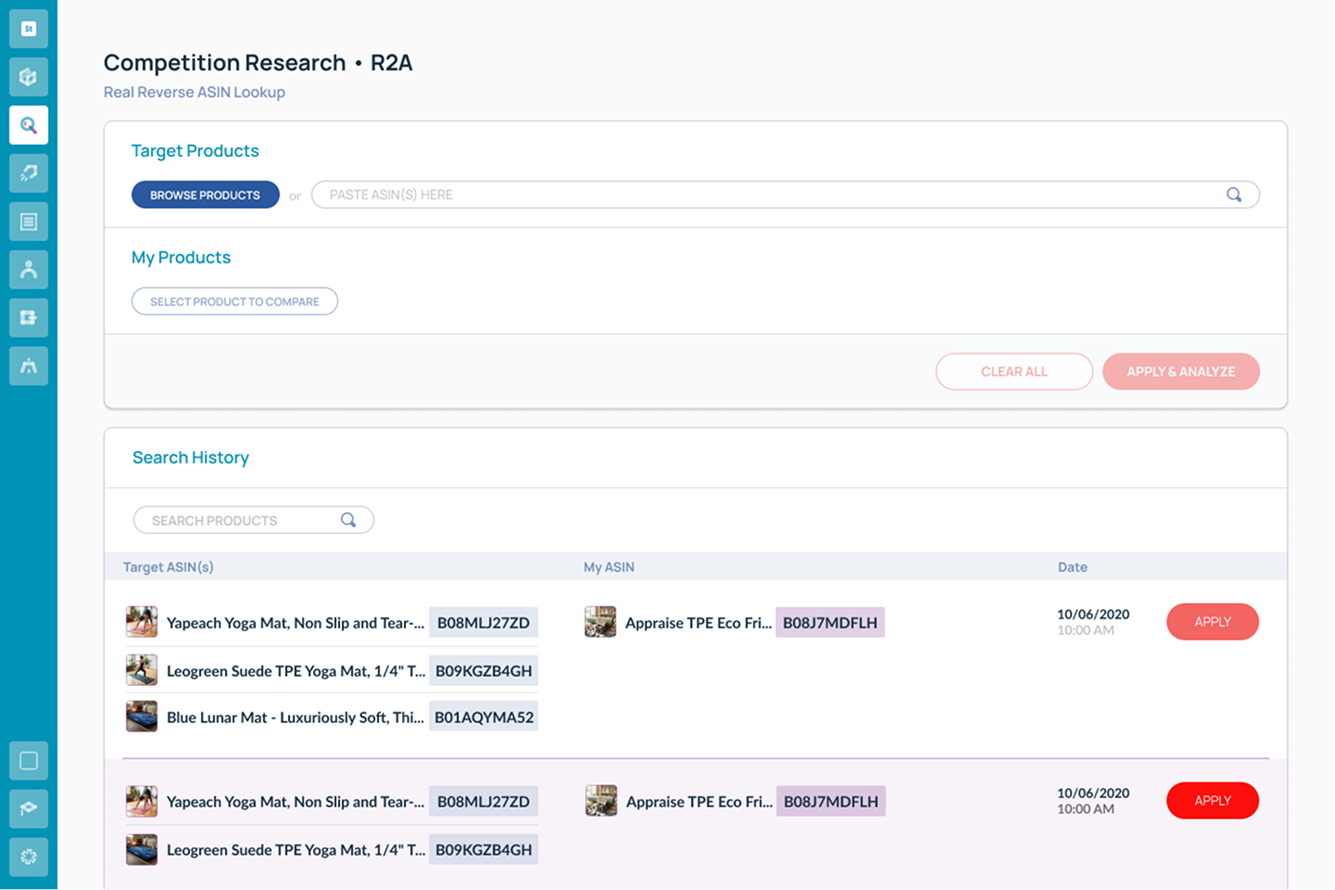
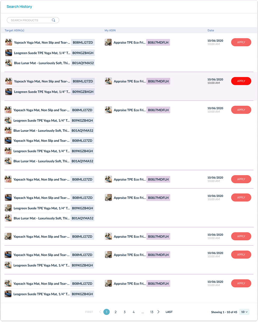
Problem:
- Sellers manually re-run complex queries or track results outside the platform, leading to wasted time and repetitive workflows.
UX Solution:
- Integrated a seamless Search History component directly beneath the competitor product management panel.
The Impact:
- Sellers instantly recall, and compare keyword performance alongside their active listings without breaking their flow.
Phase 1.Domain Immersion & User Research
Domain Mastery
Fast-tracked ASIN Tracking, Reverse ASIN Tracking, Product Research and Listing Optimization to design with solid business logic.
Direct Client Interviews
Conducted 1-on-1 calls and live meetings with existing sellers to pinpoint friction and validate feature improvements.
Rapid Iteration
Acted quickly on real-time feedback to refine tools and keep the platform ahead of market competitors.
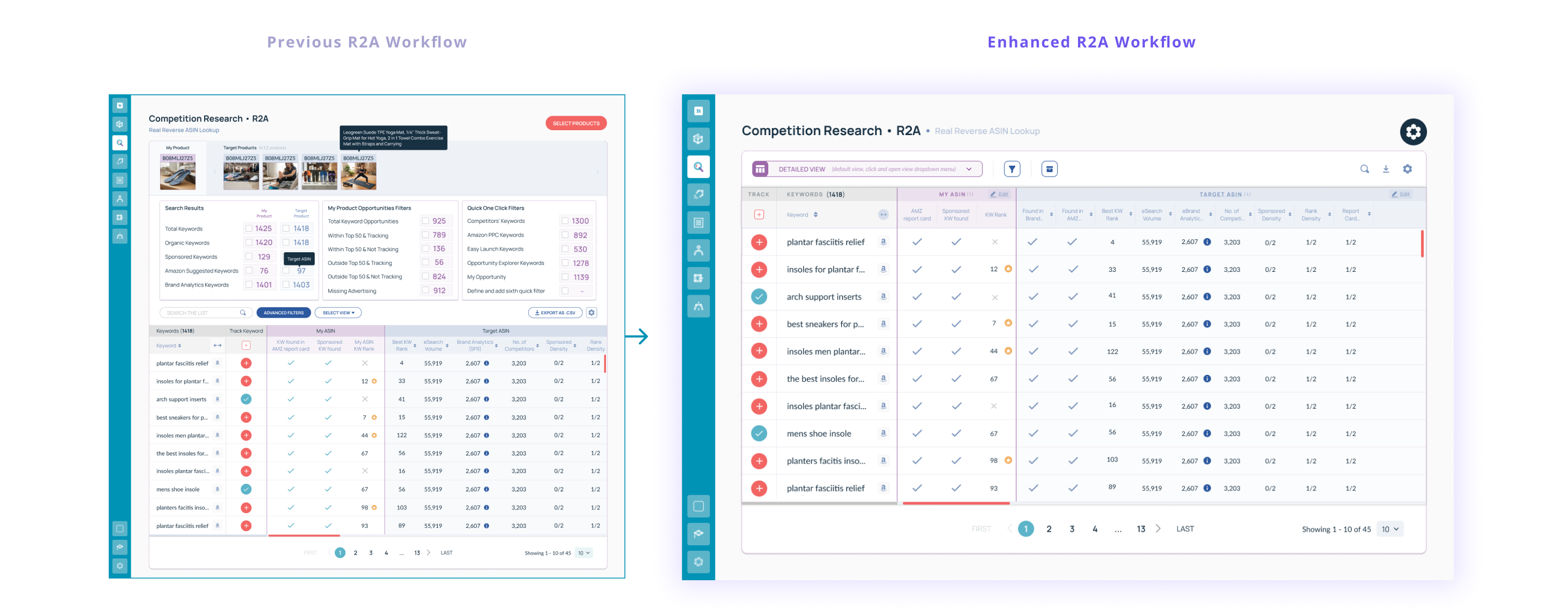
Problems:
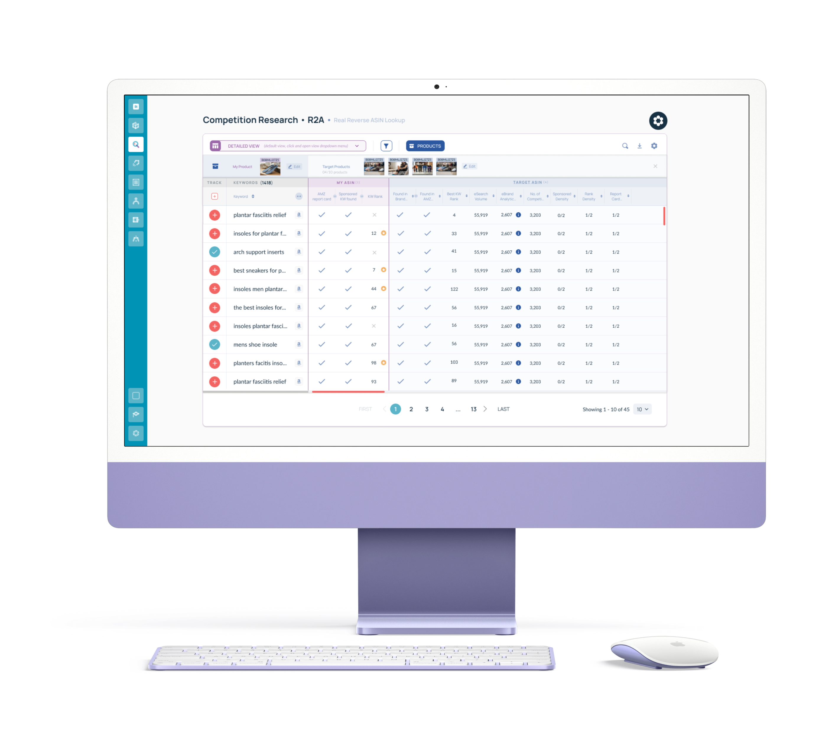
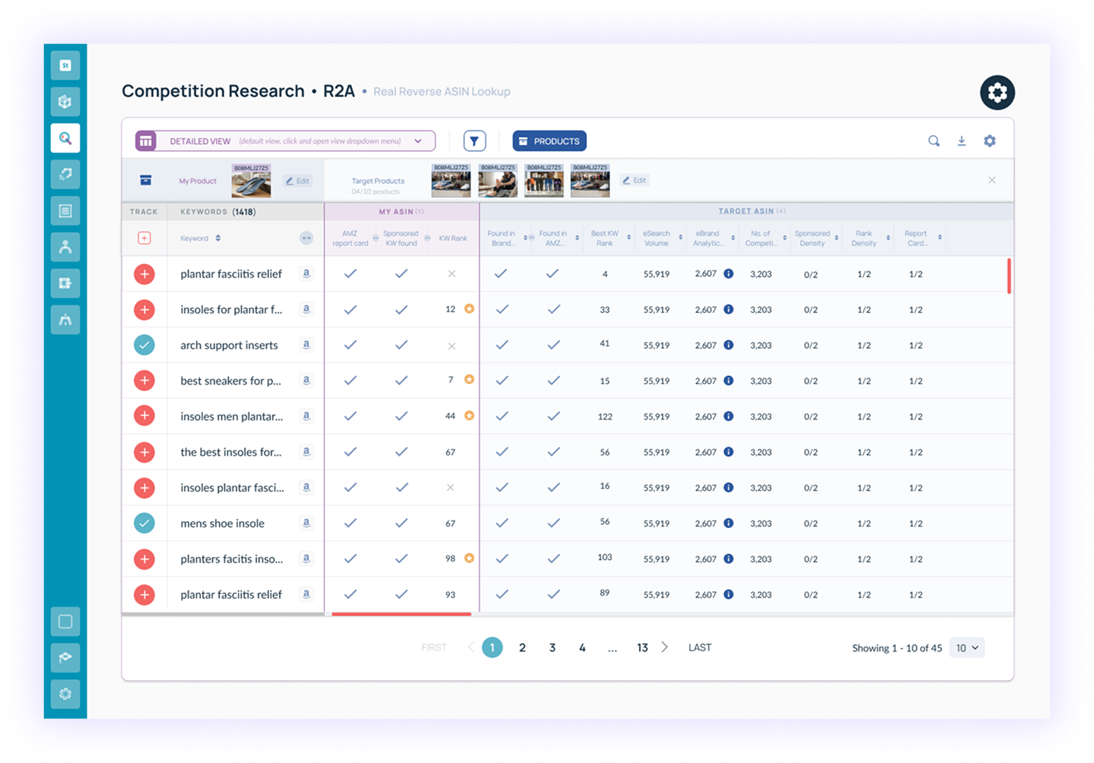
- Visual Clutter & Cognitive Overload
Without a clear visual hierarchy, users struggled to identify where to focus on the screen. - Misleading Primary CTA:
The primary “Select Products” button created confusion, as it represented a step the user had already completed prior to arriving on the screen. - Misplaced Focus:
The core output of Reverse ASIN — the keywords — was buried and lacked visual priority. - Ambiguous Filtering:
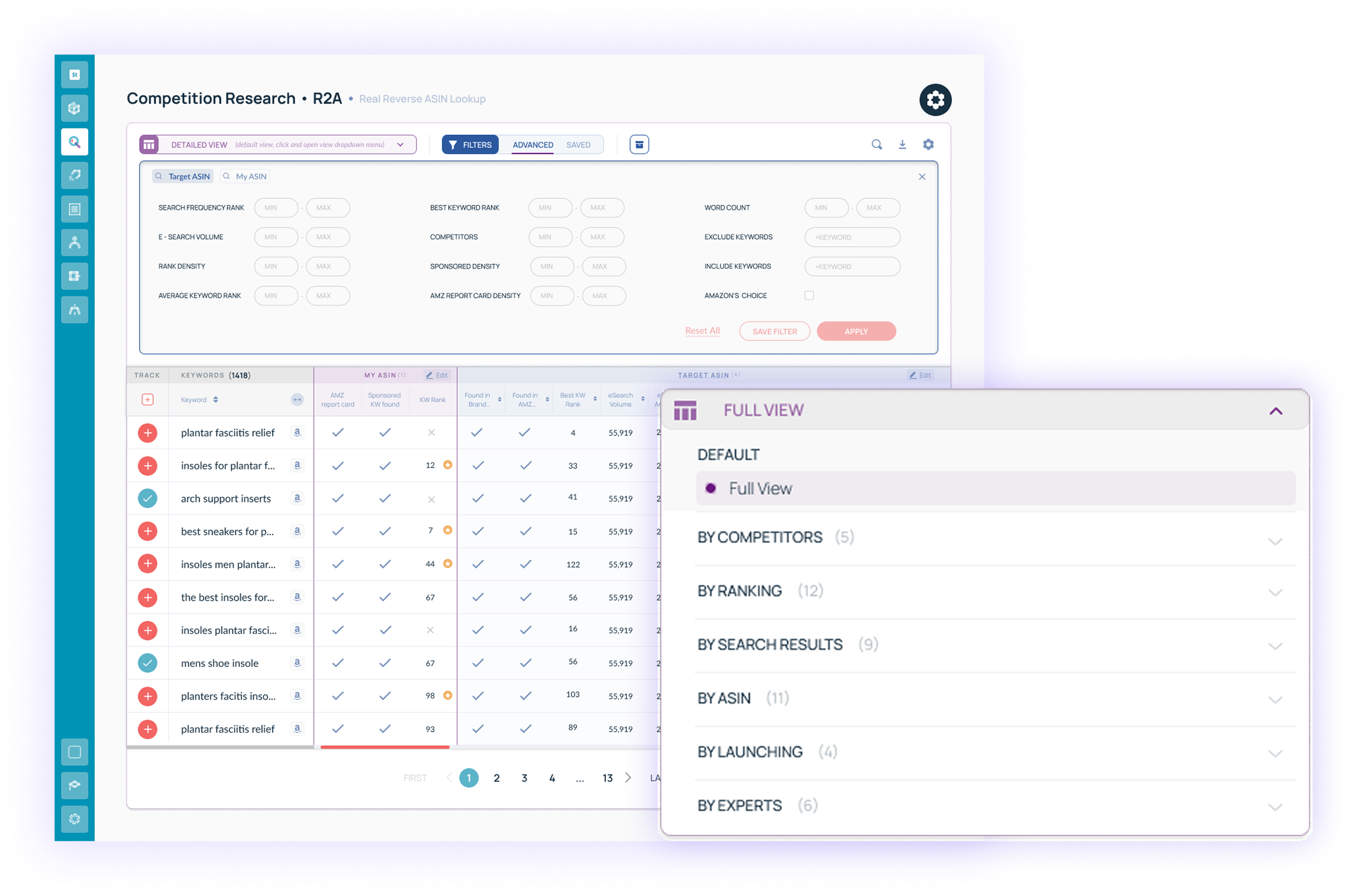
Search filters were unclear in scope, leaving users uncertain about what data was being filtered and why.
UX Solutions:
- Established Clear Visual Hierarchy:
Restructured the screen layout to make targeted keywords the primary focal point, decluttering secondary metrics into collapsible and scannable controls. - Corrected CTA Intent:
Refocused the screen on keyword tracking by placing key metrics in the top table column and replacing the dominant button with streamlined management actions. - Intuitive Filtering & Search History:
Separated Views and Filters, keeping filters focused strictly on parametric data refinement. Prominently placed a Saved Filters option, enabling users to store and re-apply their most frequent parameter presets instantly.
The Impact:
- Faster Decision-Making: Reduced cognitive load, helping users identify top-ranking keywords in seconds.
- Eliminated Workflow Friction: Removed user hesitation on next steps.
- Enhanced Competitive Analysis: Users could easily revisit previous keyword analyses using saved filters.
Phase 2.Chrome Extension Overhaul & Integration
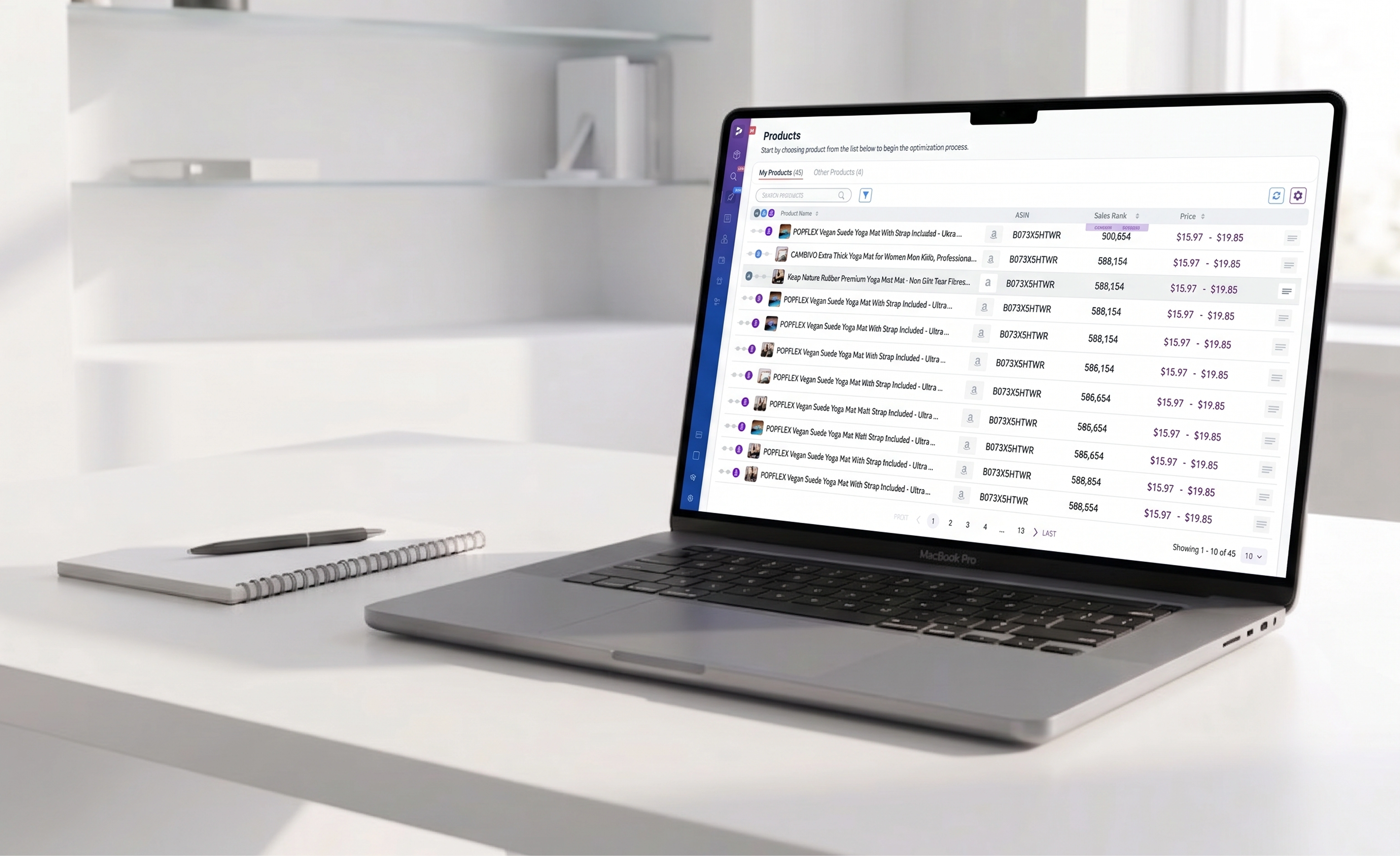
We redesigned the Chrome Extension to bring high-value platform analytics directly onto live Amazon product pages.
Every existing competitor forced sellers to break their workflow.
And we collapsed that gap, delivering traffic, sales, product research, keyword insights and listing optimization on the page sellers already use.
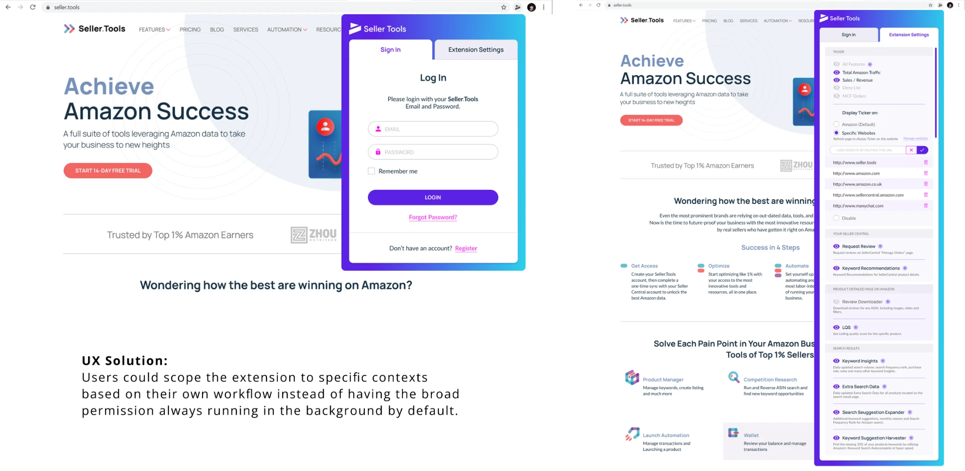
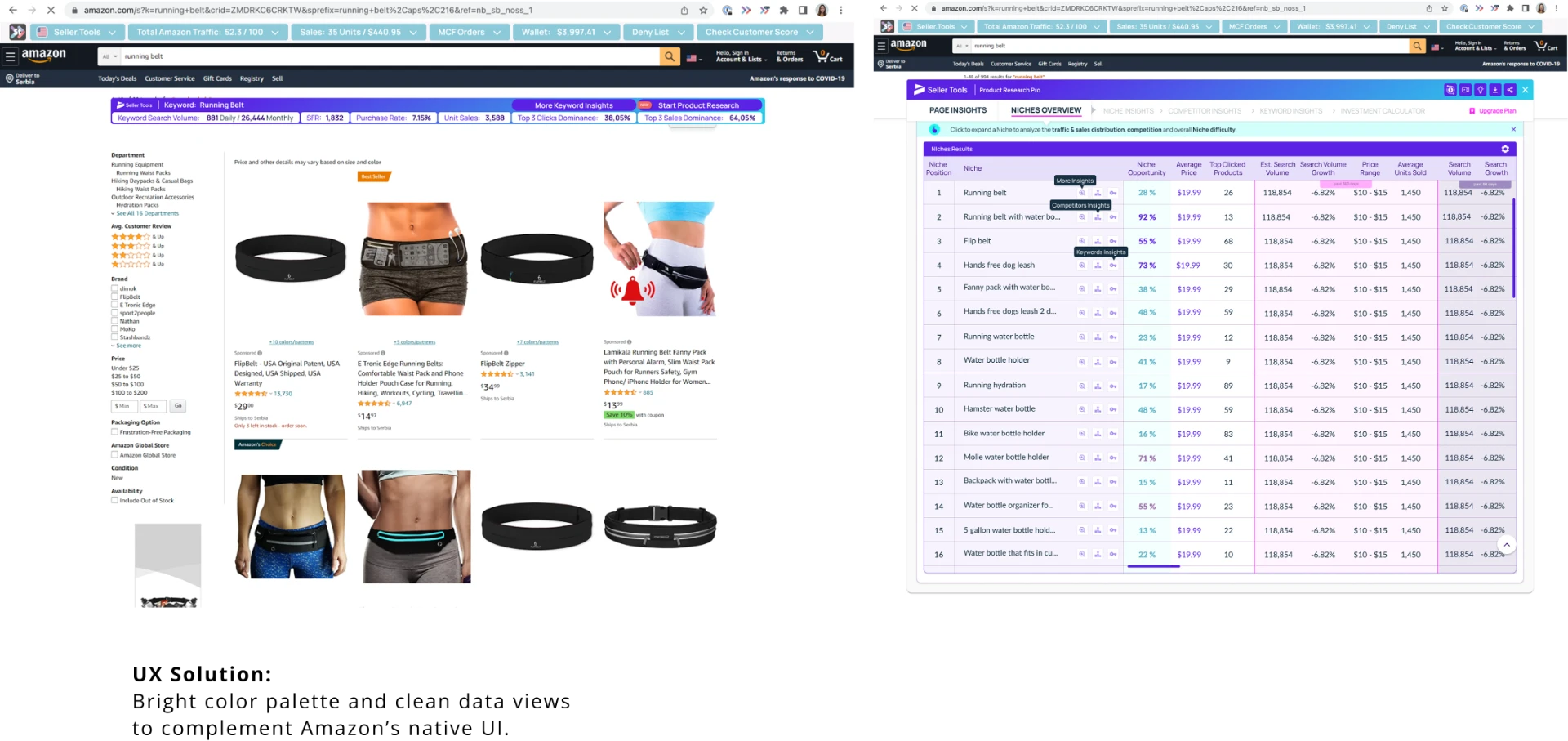
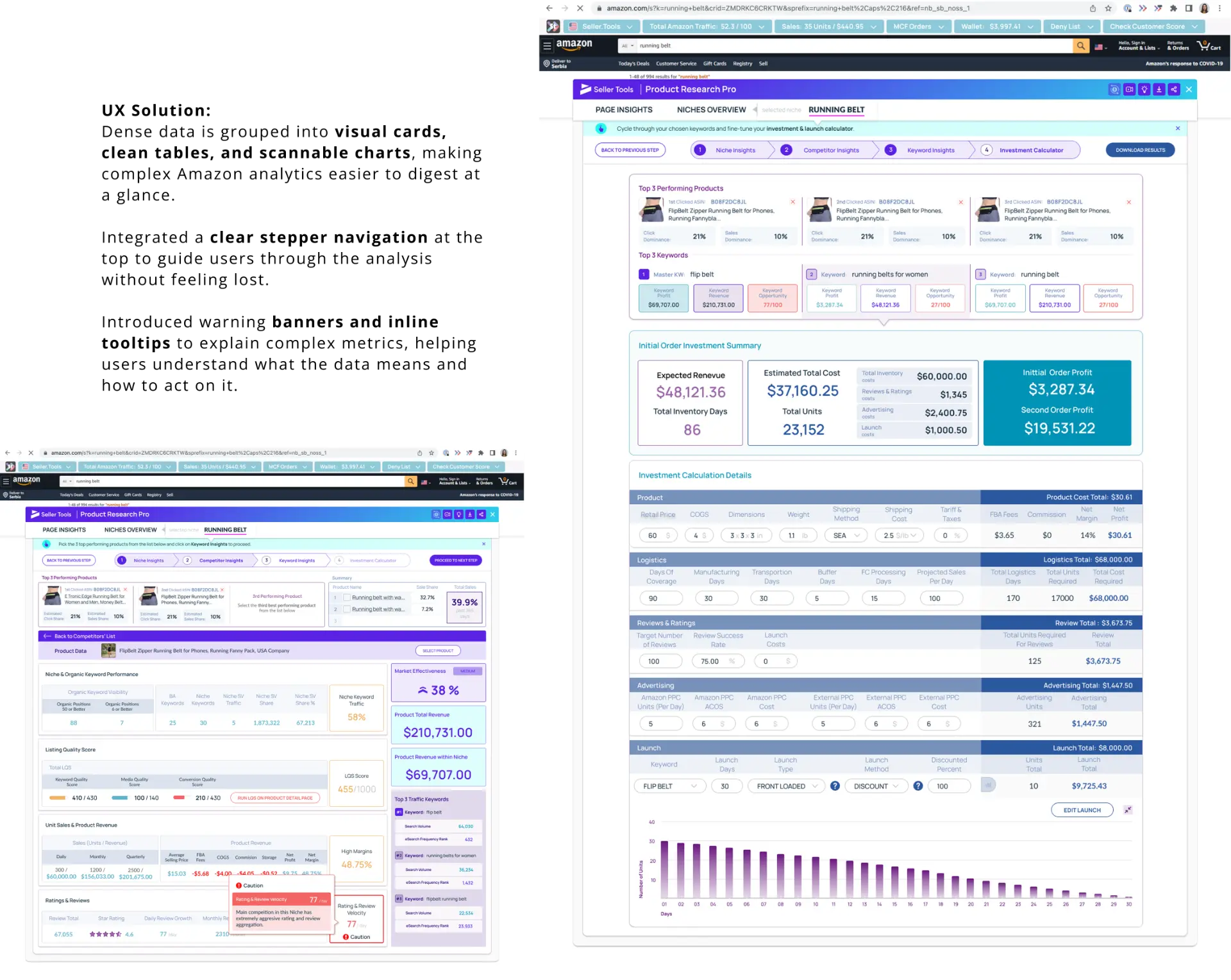
Designing an extension that overlays onto Amazon taught me that when you build inside an ecosystem you don't control, your product cannot exist in a vacuum.
- Working within Amazon’s UI required a complementary design approach. I needed to present heavy data sets while maintaining clean, uncluttered layouts that clearly deliver value - without creating visual noise or competing with native platform controls.
- I focused on essential metrics and scannable layouts that deliver a fast, legible and trustworthy experience.
Phase 3.Platform Navigation & Sidebar Redesign
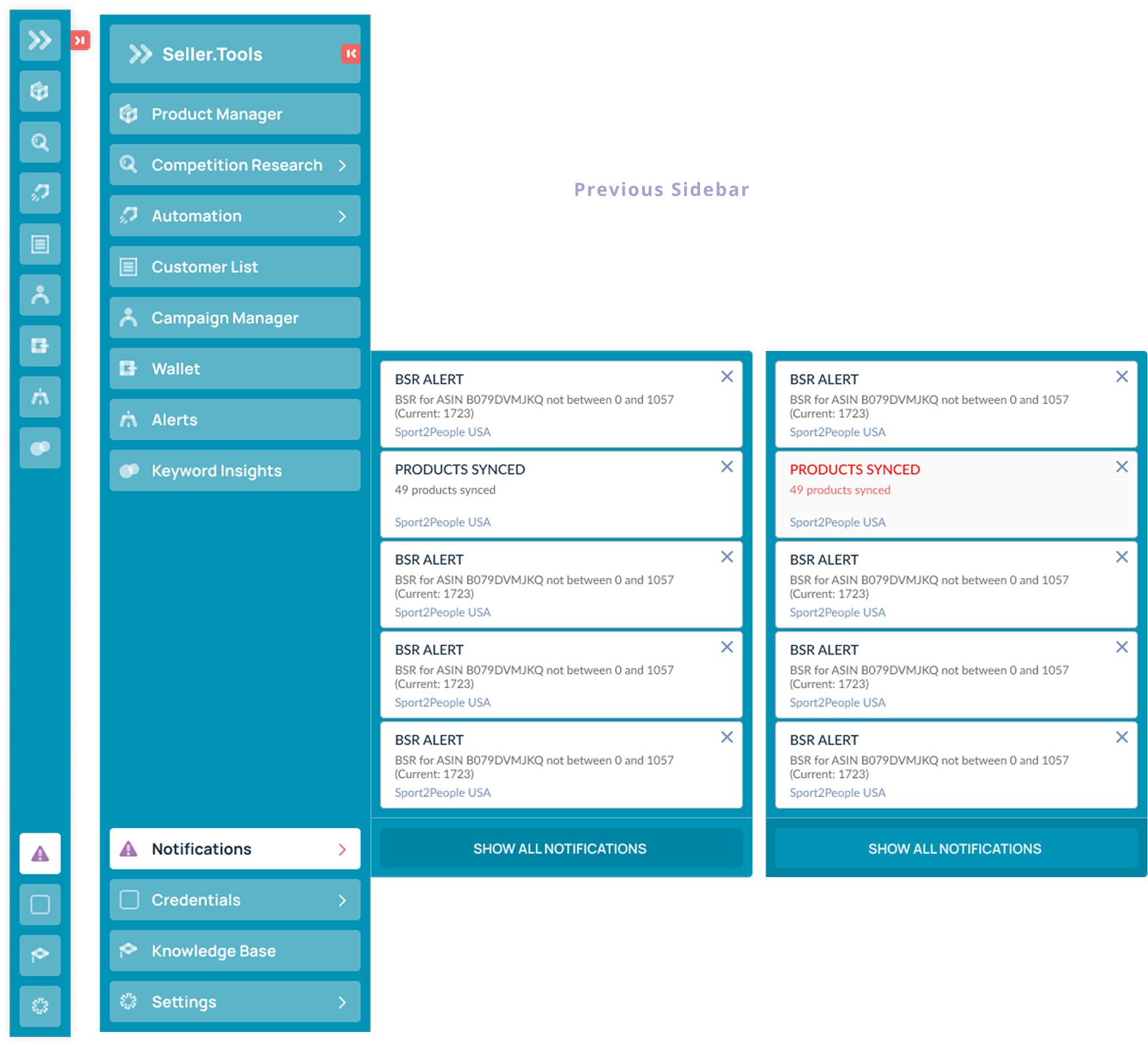
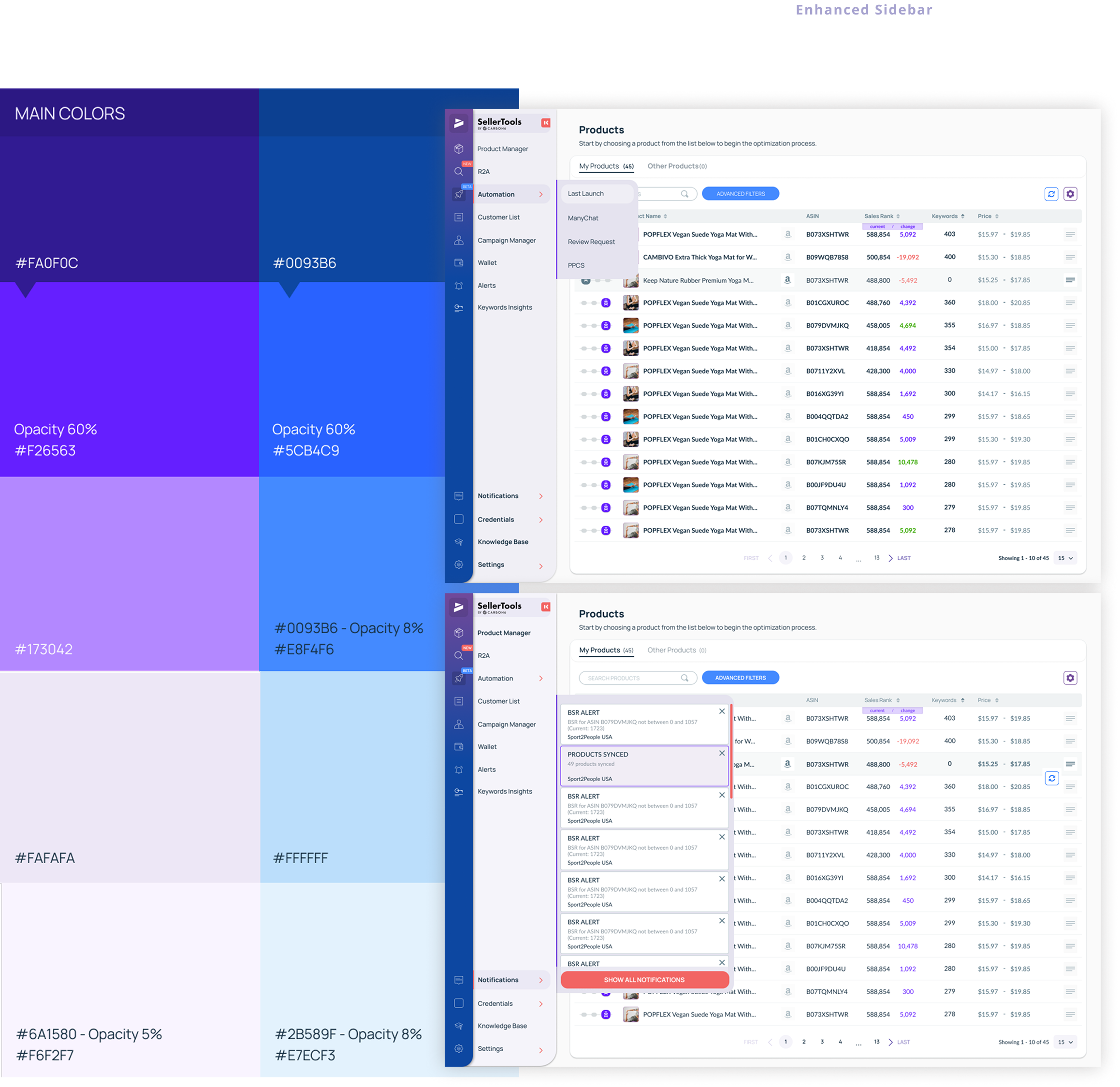
I redesigned the main platform navigation to create a scalable, unified experience.
UX Solution: Updated the color palette to seamlessly match the refreshed Chrome Extension and new brand identity, ensuring a unified visual experience across the entire product ecosystem.
Introduced a lightweight icon set that communicates intent clearly without creating unnecessary visual noise or pulling focus from primary data.
Restructured font styles, making core tools and sub-features instantly scannable.
Redesigned interactive states and CTAs within the sidebar to provide unambiguous visual cues for immediate user orientation.