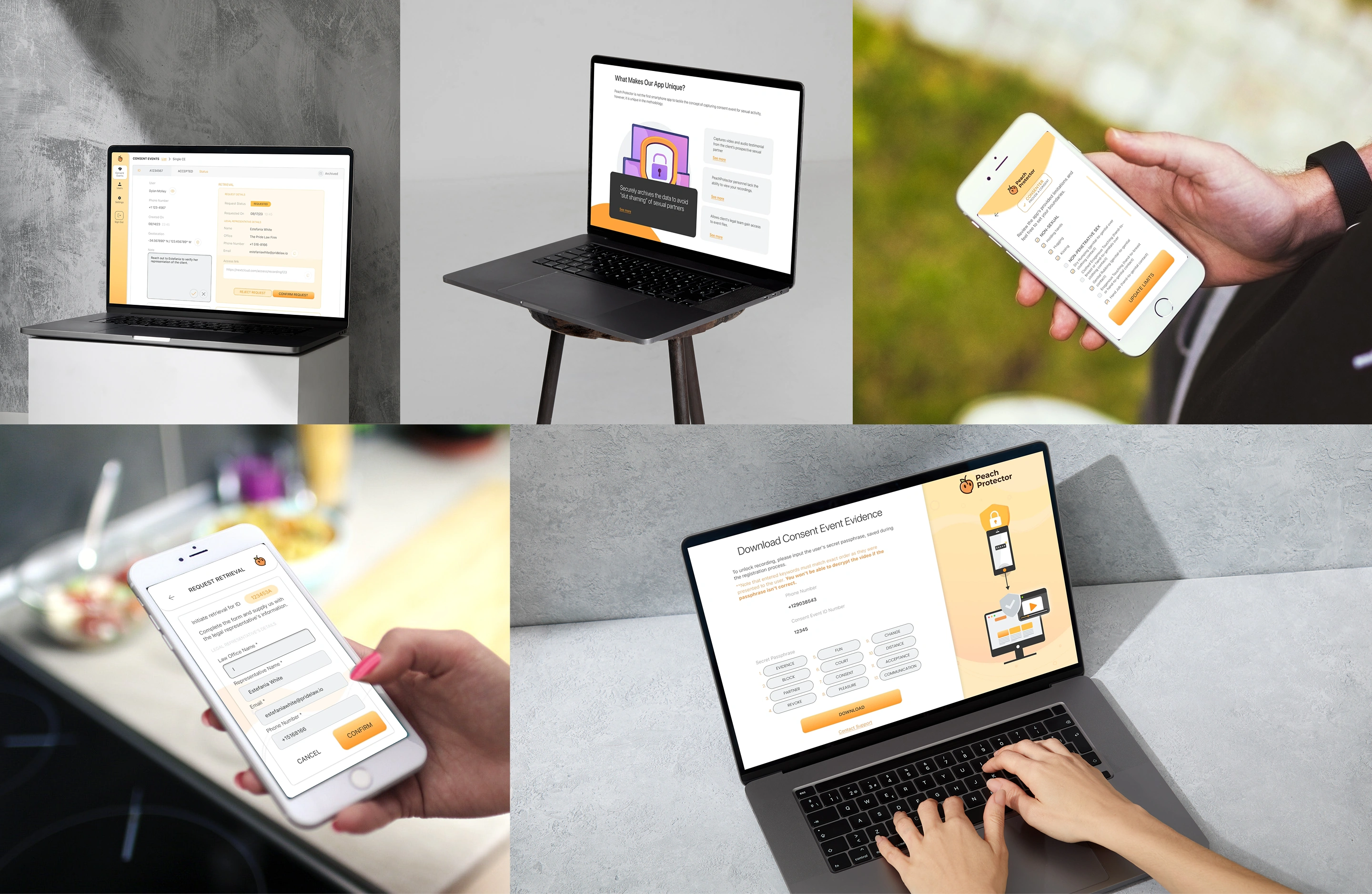

Peach Protector
Designing for Clarity, Safety, and Mutual Consent
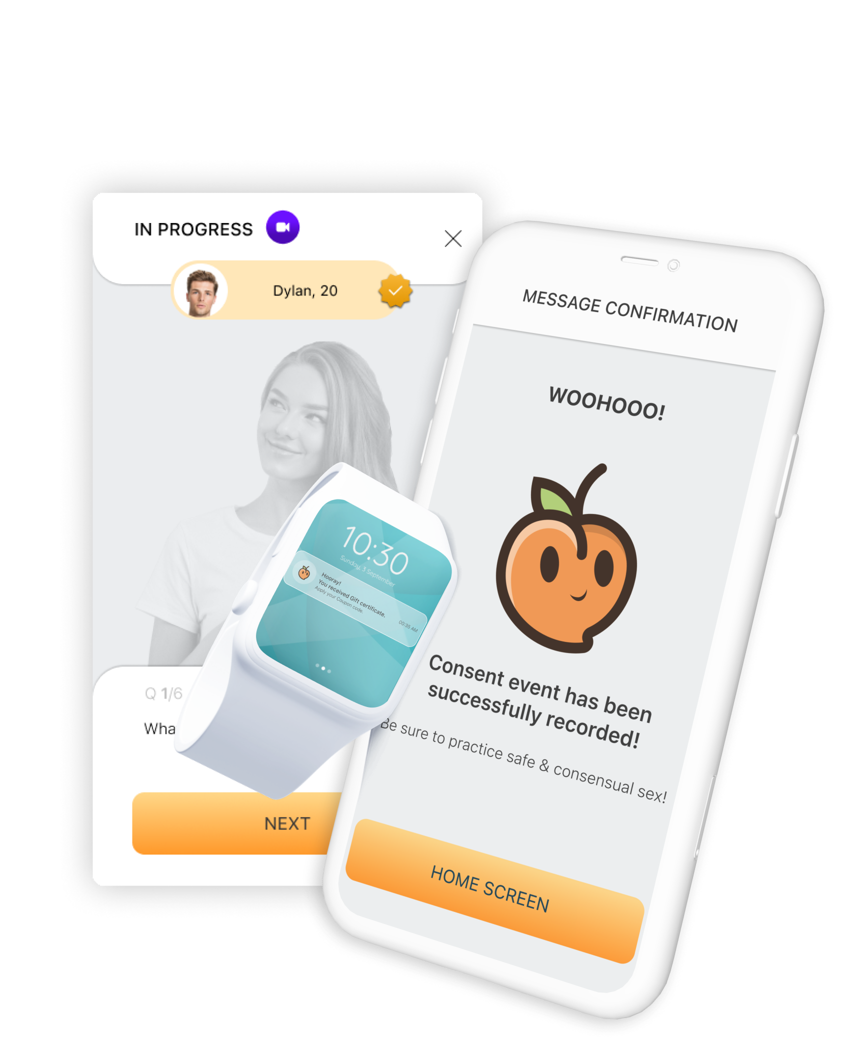
Mobile app (iOS & Android) designed to help young adults establish clear, voluntary consent before intimacy. By using audio and camera recording, it reduces misunderstandings and provides a secure, private record of mutual agreement.
MY ROLE / Lead UX/UI Designer & Product Designer
The Challenge
The Root Cause
On U.S. college campuses, misread verbal cues and ambiguous communication create severe legal and emotional risks - potentially escalating into allegations of assault or severe emotional and legal trauma.
Without an explicit, mutual agreement, young adults are left exposed to grey-area disputes.
The Solution
We needed to create a warm, non-intrusive experience that replaces cold legal formality with genuine human connection.
The UI had to be so simple and fast that registering consent feels natural, clear, and seamless - without slowing down the moment.
Phase 1.Discovery & Defining Personas
The project kicked off with deep-dive sessions with the founders and a U.S. college student whose campus experiences sparked the app's initial idea.
Additional deep research into real-world legal cases and a thorough competitive analysis.
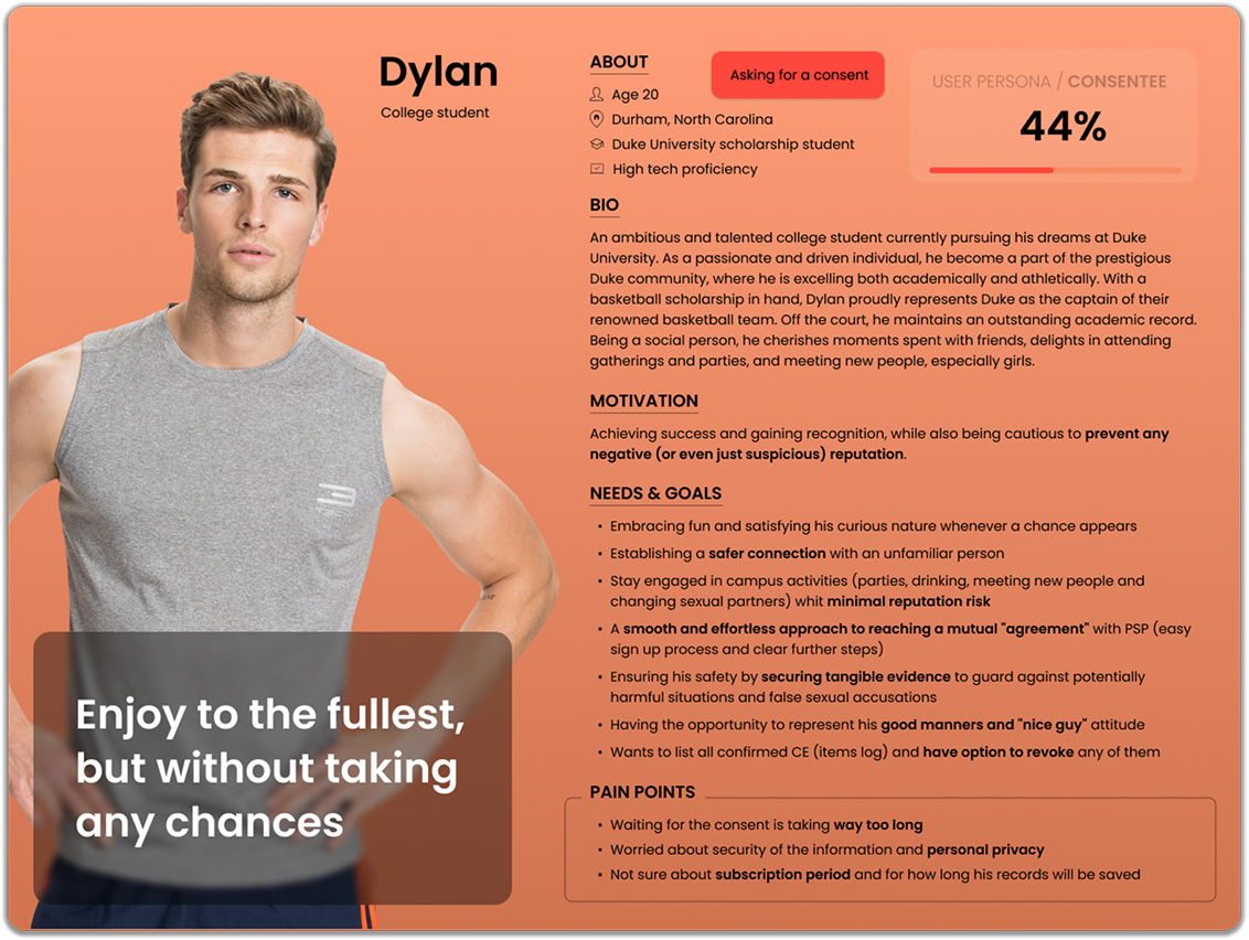
The Outcome
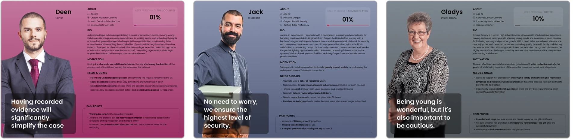
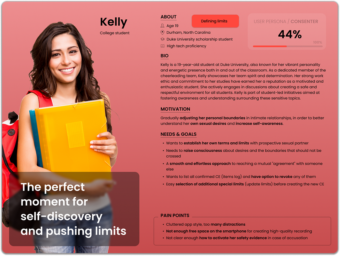
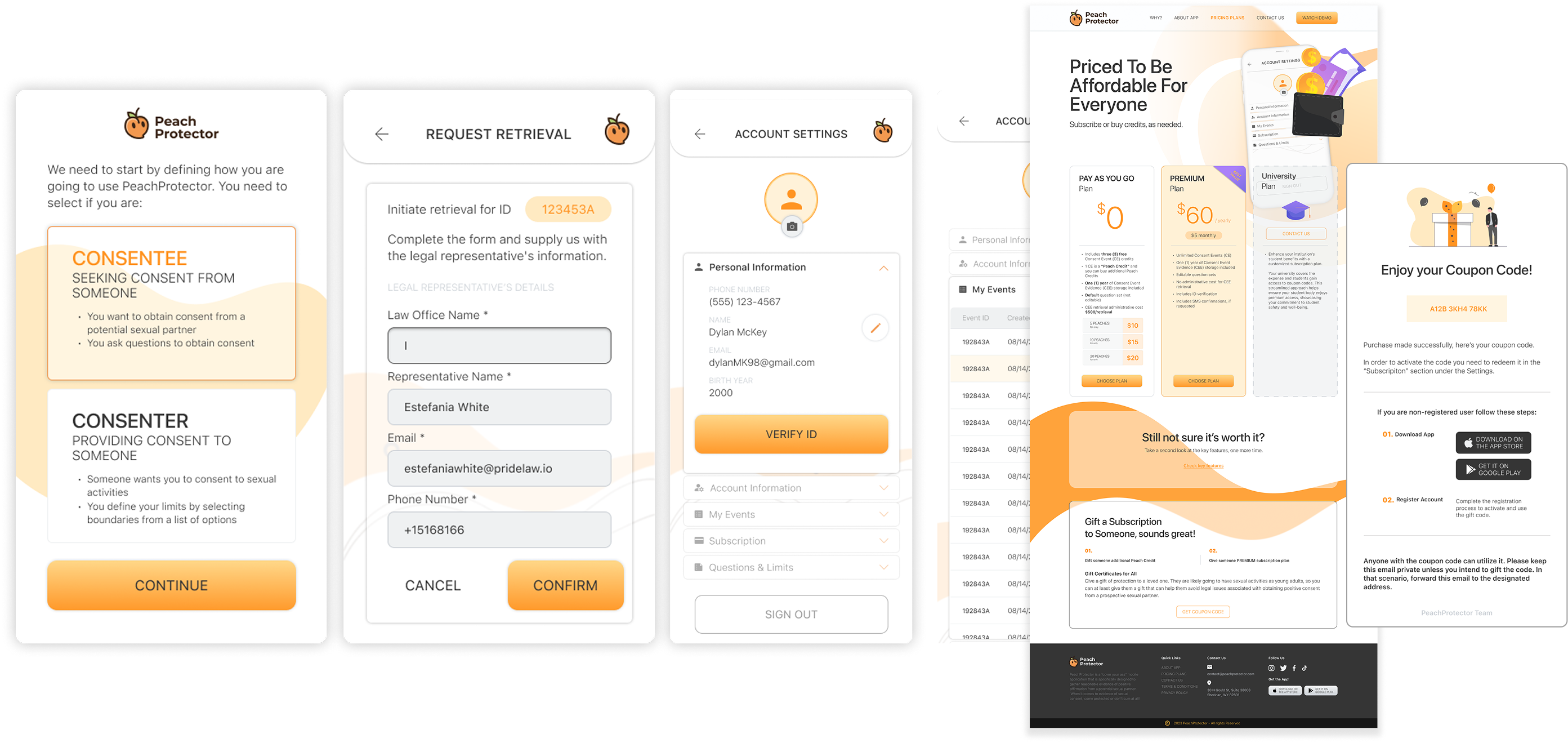
The research directly shaped our product ecosystem, leading us to tailor three distinct platforms for four key personas:
Consentee / Consenter
Mobile App
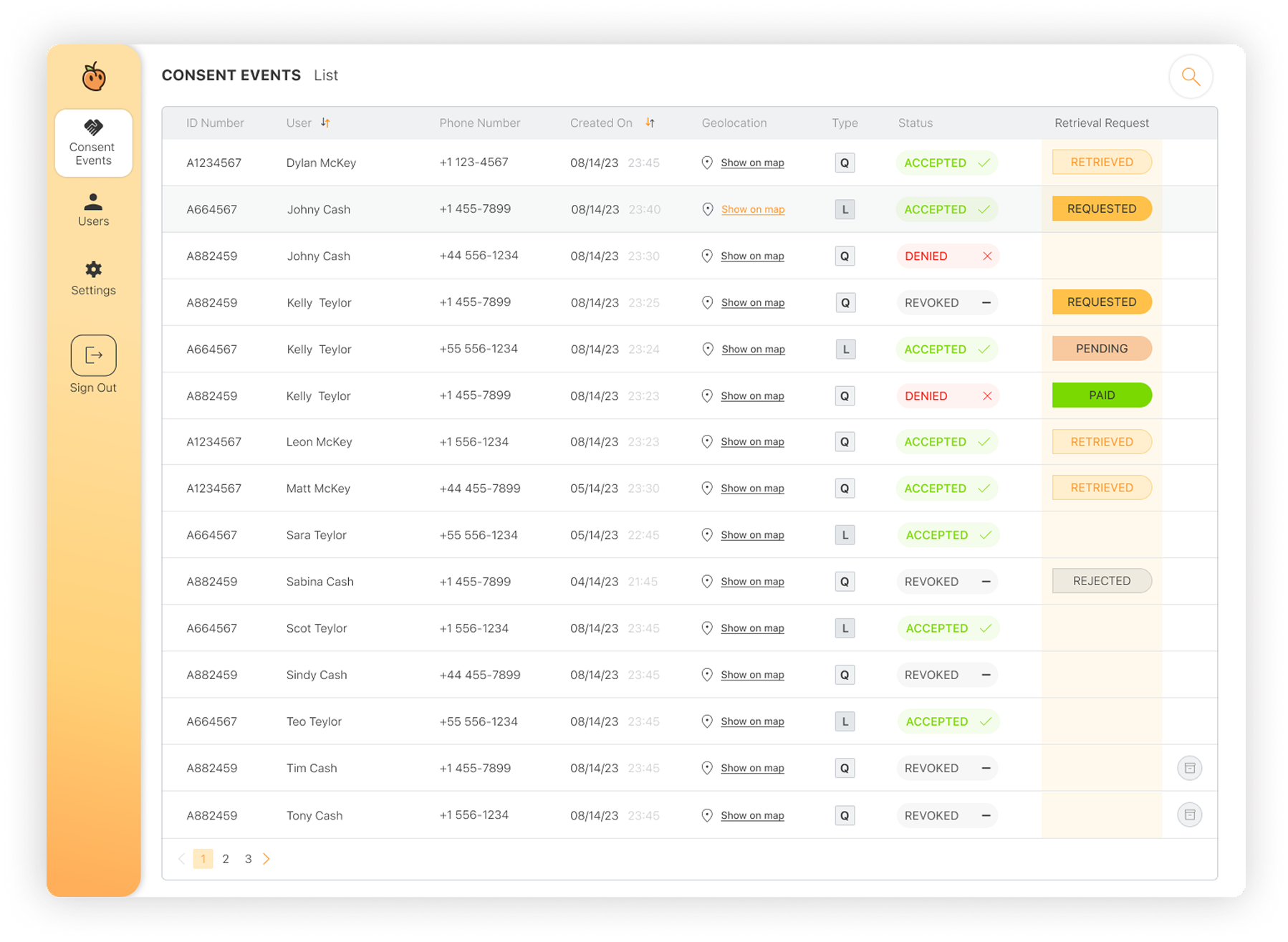
Administrator / Legal Representative
Web Platform
Gifter
Marketing Website
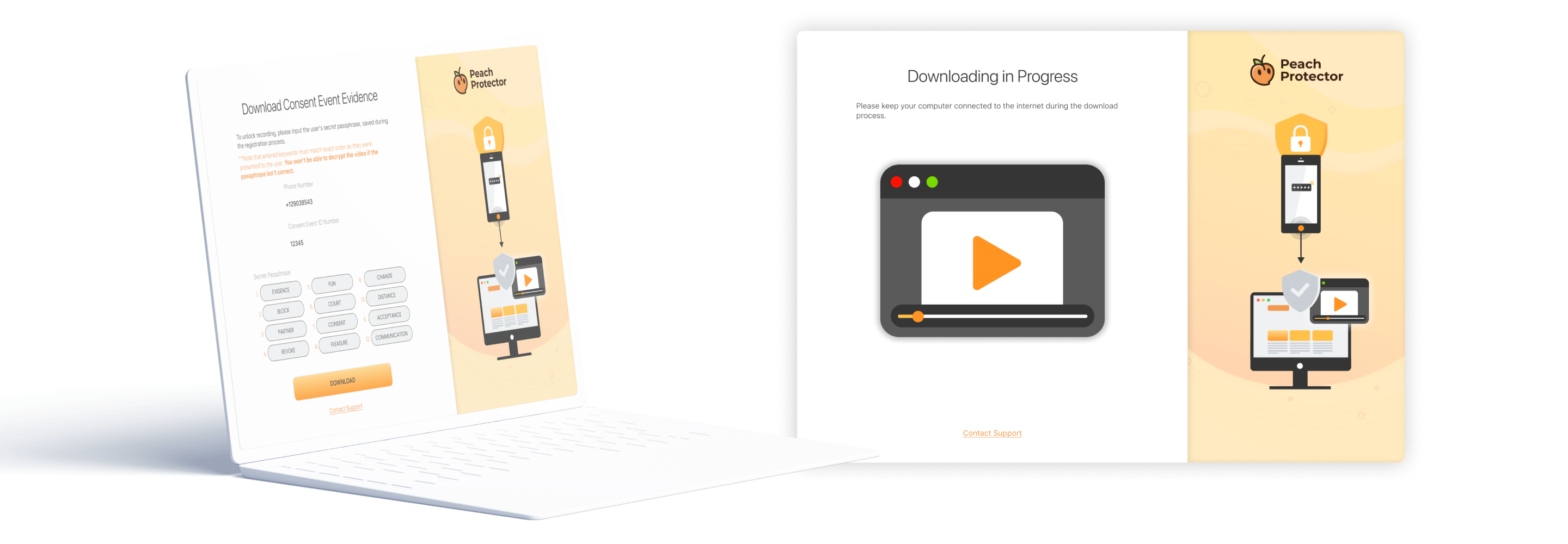
Gives admins full visibility over registered users and consent events, with instant search capabilities for swift investigation.
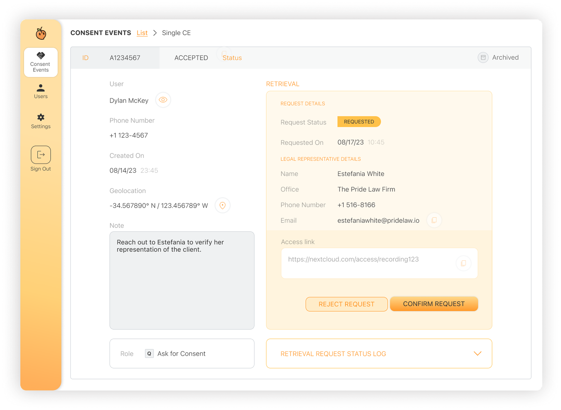
Requires the user's initial registration keyphrase to unlock and retrieve stored recordings.
Phase 2.Mapping & Iteration
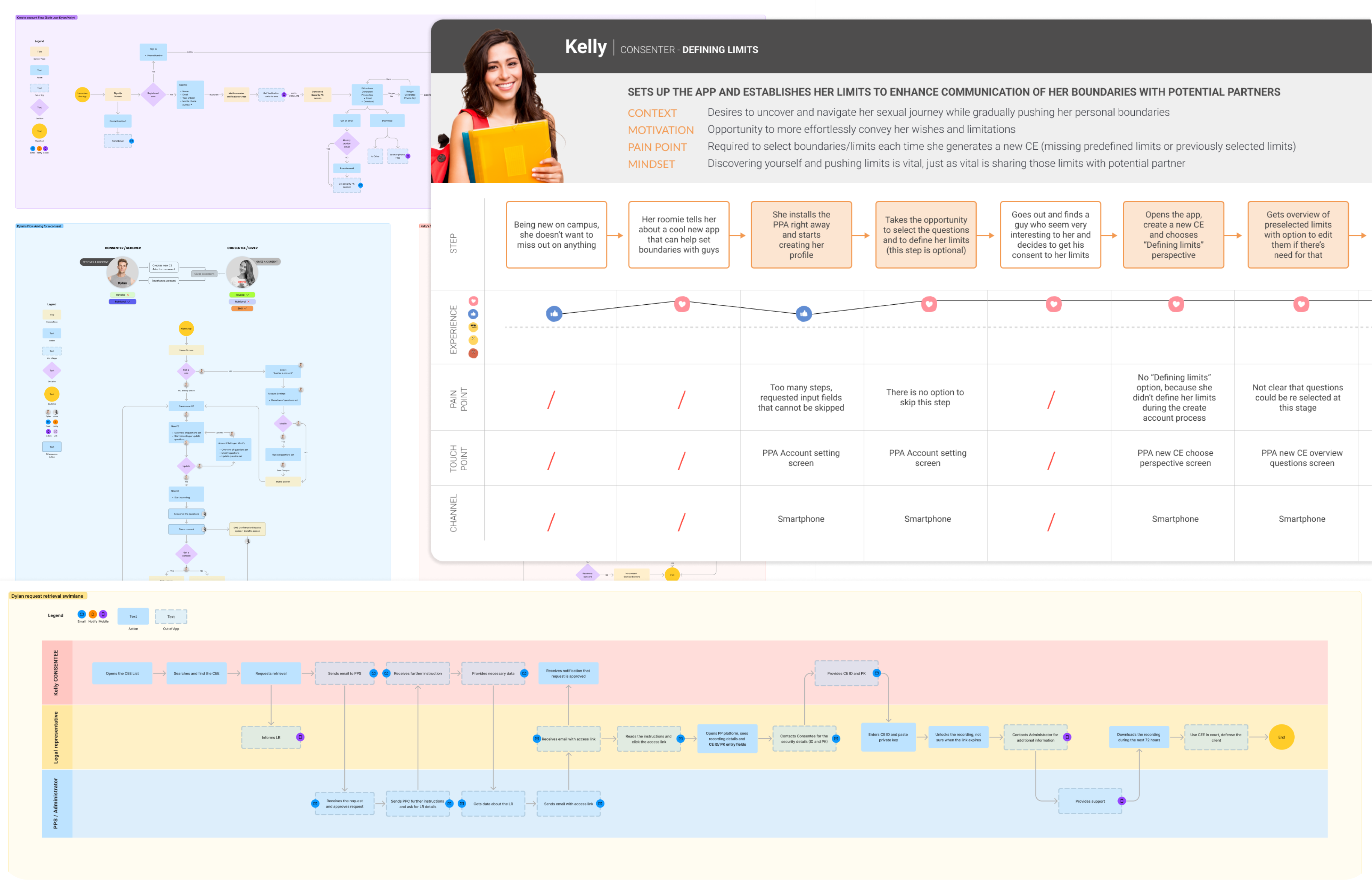
With our personas defined, I translated their needs into structured User Journeys, User Stories, and detailed Swimlane diagrams.
This step-by-step mapping allowed us to trace every touchpoint and proactively identify potential friction.
Key UX Objectives
Pain Point Prevention
We mapped edge cases to uncover critical user pain points early, ensuring no high-risk scenario or usability gap went unnoticed.
Founder Iterations
Collaborating with the founders through rapid feedback loops, we refined the flows to address real user anxieties in high-empathy moments.
Competitive Edge
Pinpointing where existing solutions fell short allowed us to tailor a smoother, more reassuring experience that sets Peach Protector apart.
The Outcome
Through swimlane mapping, we realized that handling sensitive evidence required strict security boundaries.
We established that encrypted recordings can only be accessed and retrieved by a verified legal representative - never stored locally or exposed to unauthorized parties.
Phase 3.Wireframing & Early Prototyping
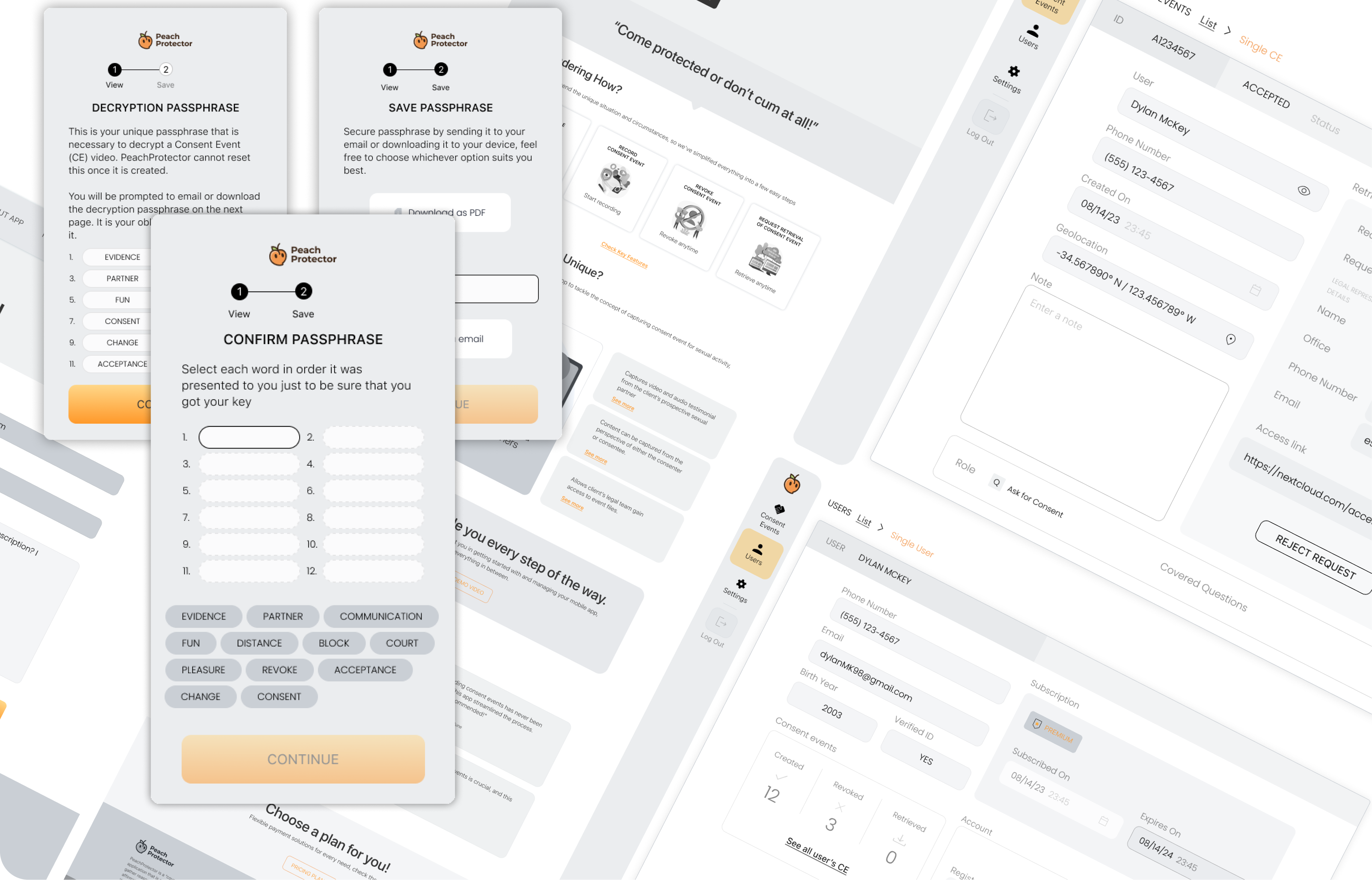
With the core architecture set, we moved into low-fidelity wireframing and interactive prototype sessions with the founders to walk through the entire flow step-by-step.
Our main focus was testing the entry flow for speed, clarity, and absolute security.
Key Prototype Insights
High user focus is unrealistic
Wireframing made us realize that due to users' high-emotion state, the UI had to be radically simple.
Remove all cognitive load
Onboarding and consent initiation had to take seconds, keeping 100% data protection seamlessly behind the scenes.
Phase 4.Visual Identity, Design System & High-Fi UI
In the final phase, I translated our tested wireframes and prototypes into a polished, high-fidelity UI.
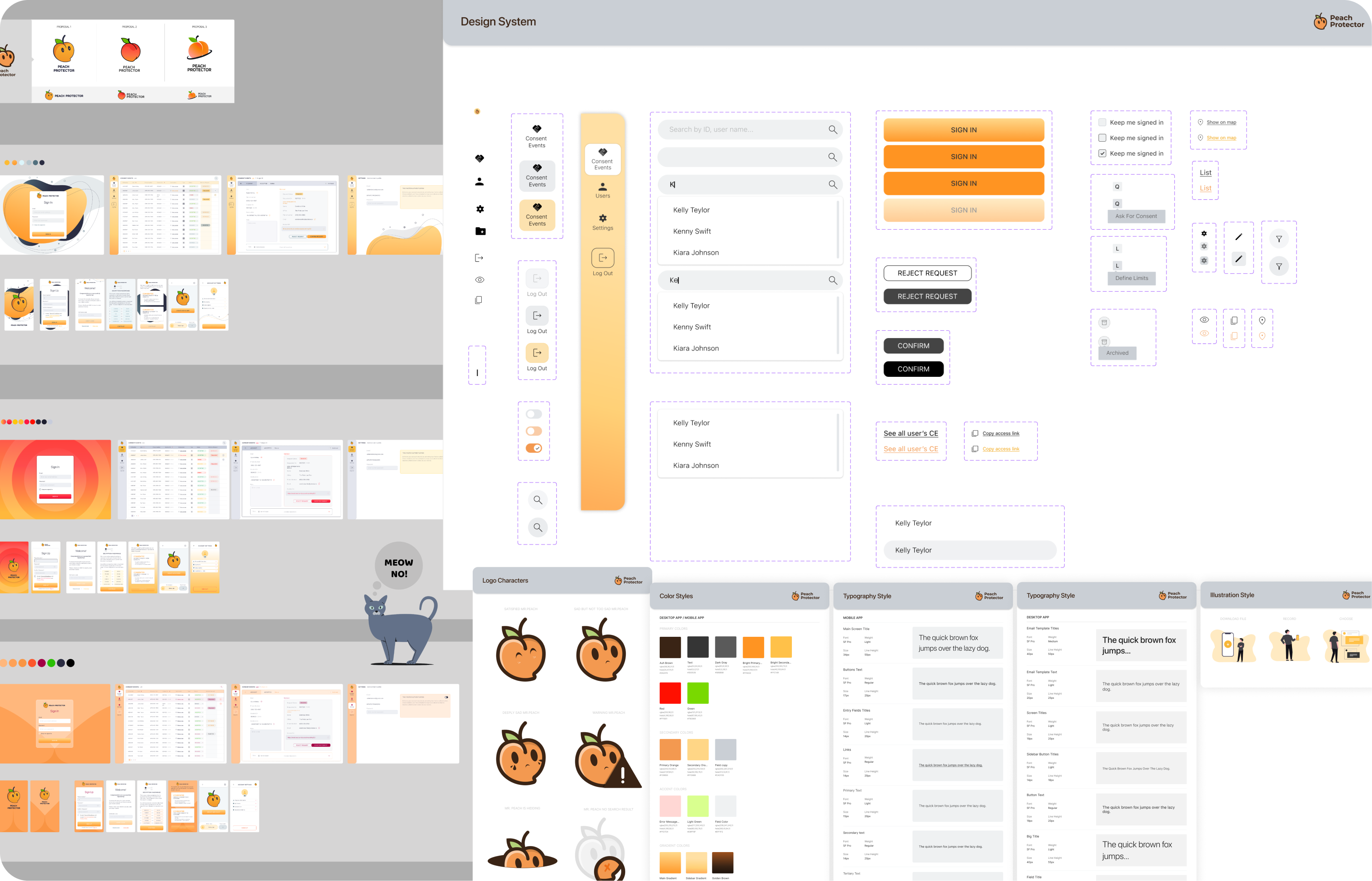
To ensure consistency across the entire ecosystem, I established a unified visual language through collaborative brand discovery and system design.
Key Elements of Phase 4
Moodboard & Brand Vibe
Striking a balance between approachability, warmth, and legal trust.
Unified Brand Guidelines
Established a unified Brand Guide, driving consistency across mobile, web, and marketing touchpoints.
Scalable Design System
Create reusable components, clear typography, and accessible color palettes, enabling seamless handoff and future scalability across all platforms.
Phase 5.Final Design & Developer Handoff & Quality Assurance
By involving the development team throughout the entire process, we caught technical constraints early and ensured every design solution was feasible, efficient, and scalable.
Key Elements of Phase 5
Continuous Alignment
The dev team already knew the product architecture, so the final handoff was a smooth walk-through.
Final File Organisation
Provided organized Figma files and clear component specifications.
Strict Quality Control
Established clear communication channels for dev alignment, encouraging immediate flags for any visual or functional discrepancies to preserve 100% brand consistency.